High-precision accessibility audit for modern UI.
Accessibility ensures that your digital products can be used by everyone. A high contrast ratio is key for high-quality UX design, improved readability, and professional compliance with global WCAG standards.
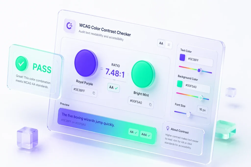
A WCAG Color Contrast Checker serves as the mathematical foundation for visual inclusivity. According to the Web Content Accessibility Guidelines (WCAG) 2.1, the relationship between foreground text and background colors must reach a specific luminance ratio to be considered readable for users with visual impairments. By integrating our WCAG Color Contrast Checker into your design workflow, you move beyond subjective aesthetic choices to data-driven accessibility decisions.
In 2026, search engines like Google have begun factoring accessibility signals more heavily into their ranking algorithms. Using a WCAG Color Contrast Checker doesn’t just help your users; it helps your SEO. High-contrast text improves “time on page” and reduces bounce rates, as content becomes easier to consume for everyone.
The WCAG Color Contrast Checker utilizes a complex formula to determine relative luminance. This formula accounts for the perceived brightness of different colors (red, green, and blue) as they appear to the human eye. Our tool automates this entire W3C Contrast Formula, giving you instant results without the calculus.
Our WCAG Color Contrast Checker breaks down results into categories: normal text, large text (18pt+), and UI components. Large text has more visual weight, requiring a lower contrast ratio (3:1) to pass AA standards.
The WCAG Color Contrast Checker is part of a broader suite of performance tools. Use these utilities to finish your production-ready assets:
Convert your high-contrast PNG exports to lightweight JPGs in seconds.
Optimize your accessible UI assets for lightning-fast page load speeds.
Format your accessible design labels into code-ready camelCase or snake_case.
Create accessible, high-contrast QR codes for mobile-first user experiences.
ProFigma: Professional Design Utilities
2026 Global Design Standards Compliant