Our Grid Maker is the ultimate solution for designers who need to establish mathematically perfect layouts for high-end digital products. Whether you are architecting a complex SaaS dashboard or a responsive landing page, this tool ensures your structure is flawless from the very first pixel. By using a professional-grade Grid Maker, you eliminate the guesswork associated with manual spacing and alignment.
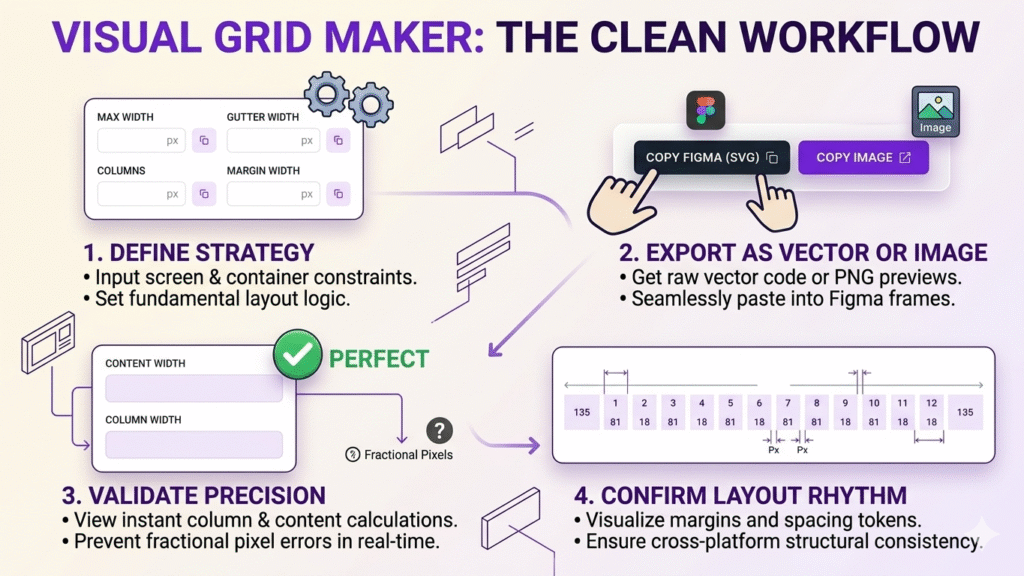
In the modern era of product design, a reliable Grid Maker is no longer a luxury; it is a necessity. High-performance teams rely on consistent vertical and horizontal rhythm to create trust and readability. When your columns don’t divide evenly into your container width, you encounter the dreaded “fractional pixel” bug. This results in blurry borders and inconsistent padding that frustrates developers. Our Grid Maker solves this by calculating exact integer values, ensuring your design adheres to Material Design layout standards.
The transition from a blank canvas to a structured layout can be the most time-consuming part of the design process. A dedicated Grid Maker automates the complex math required to balance gutters, margins, and column widths. Instead of spending twenty minutes adjusting rectangles in your design software, you can define your parameters here and see the results instantly.
Most modern web frameworks like Bootstrap and Tailwind CSS rely on the 12-column system. Our Grid Maker allows you to customize these standard systems to fit your specific brand needs while maintaining a structure that developers can easily implement using W3C CSS Grid standards.
Unlike basic calculators, this Grid Maker was built specifically for the ProFigma workflow. It offers features that directly impact your speed and precision as a UI/UX professional:
As screens vary from ultra-wide monitors to compact mobile devices, the Grid Maker helps you define how your “Max Width” behaves. By setting specific margins and gutters within the Grid Maker, you create a responsive blueprint that ensures your content stays centered and legible regardless of the user’s browser size. This level of planning is what separates amateur designs from Premium UI Components.
The versatility of a Grid Maker extends across various design disciplines. Professionals use this tool to streamline several phases of the creative lifecycle:
Ultimately, using a Grid Maker is about confidence. When you know your layout is mathematically sound, you can focus on the creative aspects—typography, color, and interaction—knowing that the foundation is solid. Whether you are building a ProFigma Dashboard or a simple portfolio, let our Grid Maker handle the math so you can focus on the design.