5 Best Figma Plugins Every UI/UX Designer Should Try
· 10 min read · by the ProFigma team
The best Figma plugins remove repetitive work: finding photos and icons, filling placeholder text, mapping user flows and checking accessibility. This guide covers five plugins UI/UX designers use often, what each is good for and how to test a plugin before adding it to your workflow. Keep only the ones you will use weekly.
Key takeaways
- Plugins are third-party tools that extend Figma; you do not need dozens of them.
- Unsplash, Iconify, Content Reel, Autoflow and Lorem ipsum solve the most common mockup chores.
- Add an accessibility plugin such as Stark if you ship interfaces to real users.
- Check the Community page for pricing, reviews and the last update before installing.
- Review your plugin list every few months and remove what you do not use.
The five plugins at a glance
| Plugin | What it does | Best for |
|---|---|---|
| Unsplash | Inserts photos from Unsplash into frames and shapes | Realistic hero images and cards |
| Iconify | Searches many icon sets and inserts them as vectors | UI icons without leaving Figma |
| Content Reel | Fills layers with realistic names, avatars, text and more | Replacing placeholder content |
| Autoflow | Draws connecting arrows between frames | User flows and journey maps |
| Lorem ipsum | Generates placeholder text | Quick text fills when real copy is not ready |
1. Unsplash
The Unsplash plugin lets you search for photos and drop them into selected frames or shapes without downloading files first. It is ideal for hero sections, blog cards and profile mockups, where a real photo makes a layout feel believable.
Photos are free to use under the Unsplash license, but read the current license terms for client projects and keep credit information if your project requires it. For final production, replace placeholders with images you have rights to use.
2. Iconify
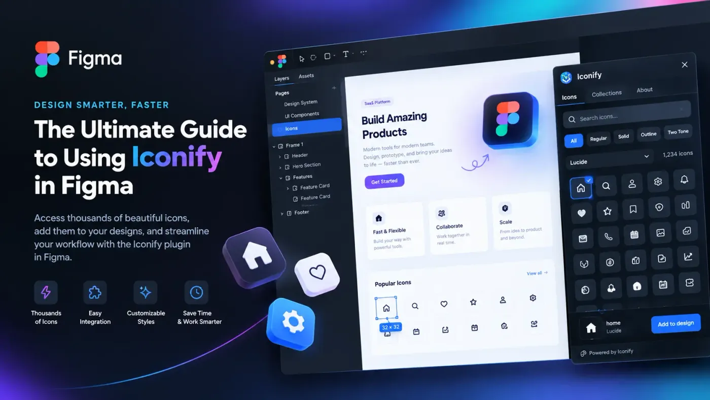
Iconify gives you access to a large collection of icon sets inside one search box. Select a frame, search for "search" or "cart" and insert the icon as an editable vector.
The main benefit is consistency: pick one icon set and use it across the whole design. Mixing line weights and styles from different sets is a quick way to make an interface look unpolished. Check the license of the specific set you choose if you plan to ship the icons in a product.
3. Content Reel
Content Reel replaces placeholder content with realistic data. You can fill text layers with names, locations or other sample data and fill shapes with avatars or images. Figma's own learning material mentions it as a way to replace placeholder content quickly.
It is especially helpful for lists, tables and cards. Realistic data shows problems that "Lorem ipsum" hides, such as long names breaking a layout or missing images leaving gaps.
4. Autoflow
Autoflow draws arrows between frames, so you can show how a user moves through a product. Select two frames, run the plugin and it connects them, keeping the line attached when you move frames.
It is useful for onboarding flows, checkout paths and presentations to stakeholders. For flows with many branches, consider FigJam as well, which is designed for diagramming.
5. Lorem ipsum
Lorem ipsum plugins generate dummy text so you can see how a layout handles paragraphs. There are several versions in Figma Community, so check the description and pick one that fits your needs.
Use placeholder text sparingly. Real, rough copy gives a more honest layout test, and design reviews are easier when everyone can read what the screen is supposed to say.
Plugins for accessibility, design systems and 3D
Beyond the everyday five, three more categories are worth knowing about.
Accessibility
Stark is a widely used accessibility plugin that helps check contrast and other issues inside Figma. For quick standalone checks, the WCAG color contrast checker lets you test any pair of colors, and the WCAG 2.2 quick reference lists the criteria.
Design systems
If you set up a new project often, a generator can build the starting point. The Figma design system generator plugin creates colors, typography, spacing, Light and Dark variable modes and component variants from a few choices. Its free plan covers colors, five text styles and a primary button, and Pro is a one-time payment.
3D and mockups
For product visuals, MeshShot, a 3D plugin for Figma imports GLB, OBJ or FBX models, adds lighting and camera moves and exports a snapshot, video or GIF.
How to install, run and remove a Figma plugin
- Find it. Open the Resources menu in Figma, choose Plugins and search the Community, or browse the Figma Community website.
- Check the page. Read the description, any pricing and the update date.
- Install. Click Run or Save on the plugin page. Saved plugins appear in your Plugins list.
- Run it. Open the Plugins menu from the canvas context menu or Quick Actions (Ctrl or Cmd + /) and choose the plugin.
- Remove it. In the Plugins menu, manage your saved plugins and remove the ones you no longer want.
Figma's help center explains the process and the current menu names, which can change as the interface is updated.
How to judge plugin safety and updates before installing
Plugins run code that can read and change your file, so treat them with some care, especially on client work.
- Publisher: prefer plugins from known publishers or those with a clear website and support contact.
- Reviews and usage: read recent comments, not just the star rating.
- Last update: a plugin that has not been touched in years may break or behave oddly.
- Permissions: be cautious if a plugin needs network access for something that should not need it, and test on a copy of your file first.
- Company policy: if you work in a team, check whether your organization restricts plugins.
How to choose the right plugin
Ask three questions. Does this solve a task I do every week? Is there a built-in feature that already does it? Can I explain what it does in one sentence? If you answer no to the first, skip it.
A short list wins over a long one. Plugins only run when launched, but a crowded menu slows you down. Review the list every few months and remove what you have not used.
Combine plugins with ready-made components
Plugins fill in content; components provide structure. A good workflow is to start with ready-made sections, add realistic images, icons and content with plugins, and connect the screens with a flow tool. You can copy ready-made components into Figma from ProFigma and then use the plugins above to make them feel real.
Conclusion
The best Figma plugins save time on chores so you can focus on design decisions. Start with Unsplash, Iconify, Content Reel and Autoflow, add accessibility and system tools when your projects need them and check every plugin before it touches client files.
If your next step is building a consistent base for a new project, try the Figma design system generator plugin and see how much setup it removes.
FAQ
What are the best Figma plugins for beginners?
Start with Unsplash for photos, Iconify for icons, Lorem ipsum for placeholder text and Autoflow for user flows. They are simple, solve common tasks and make mockups look realistic quickly.
Are Figma plugins free?
Many are free, and some offer paid plans or limits. Check the plugin page in Figma Community for pricing before relying on it in client work.
Where do I find Figma plugins?
Open Resources in Figma, choose Plugins and search the Community, or browse the Figma Community website. Read the description, reviews and update date before installing.
Can too many plugins slow Figma down?
Plugins only run when you launch them, but a long list makes the menu harder to use. Remove ones you have not used in months and keep a short, useful set.
Should every designer use the same plugins?
No. Choose plugins that match your work: UI designers may want icons and content tools, product designers flow mapping, and design system teams token and component tools.