

The Figma design system generator plugin that builds it all in 60 seconds
Pick your industry and tone. Get a finished design system in Figma: colors, typography, spacing, effects, grids, Light & Dark variables and 145 linked components.
Days of setup, done in one flow
Tokens, styles, variables and components usually take days to set up by hand. This Figma design system generator plugin builds them in one guided flow, and every part stays editable.
Generate by industry & tone
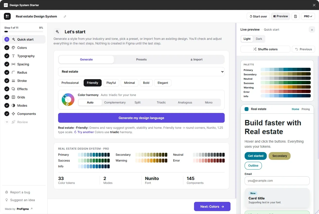
Pick SaaS, finance, health, real estate and more, plus a tone like Professional or Playful. You get a matching palette, font, type scale and shapes in one click.
Colors that never clash
Secondary colors follow color-wheel harmony (complementary, split, triadic, analogous or mono), and every color is checked for readable WCAG contrast.
One switch for every mode
Light, Dark and custom modes hold colors and sizes, so one mode switch updates your whole frame.
145 linked components
Buttons, inputs, controls, badges, cards, alerts, tabs, modals and navbars, all bound to your variables.
--radius-md: 12px;
--space-lg: 16px;
Ready for developers
Export tokens.json (W3C), CSS variables for every mode or a Tailwind config, and import tokens back.
See every step, before anything is created
An 11-step wizard with a live preview. Click a step, or let the tour play.
Start with your industry and tone
Choose one of 12 industries and 6 tones, pick a color harmony and generate. Or start from a preset (Material, iOS, Fluent, Tailwind) or import an existing design.
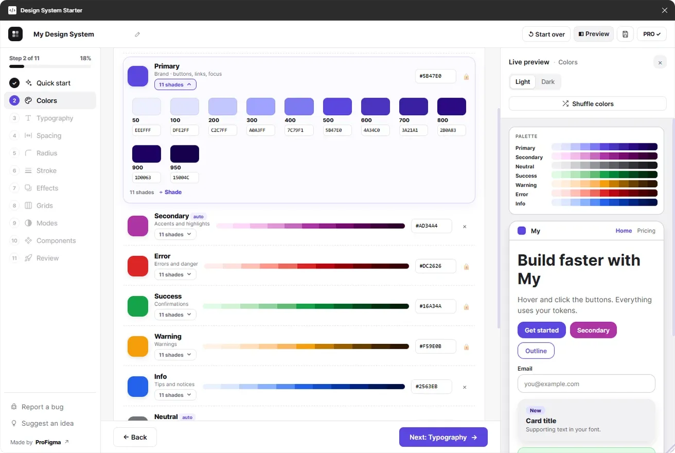
A full color system with editable shades
Every color gets 11 shades from 50 to 950. Edit any shade's hex code, remove the ones you don't need, or add your own colors.
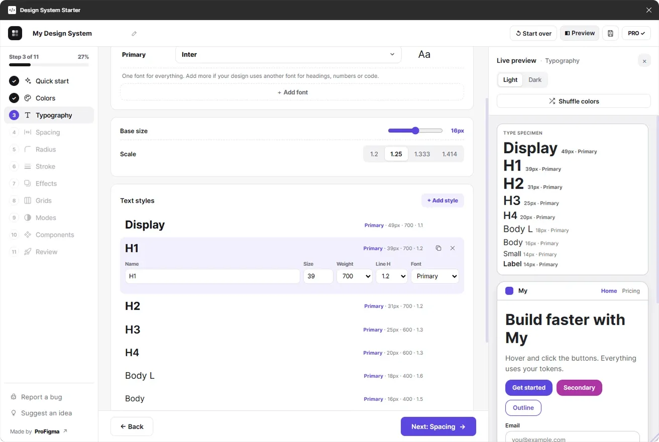
Type scale and text styles in seconds
Choose any font, a base size and a scale. Edit, duplicate or add text styles, and use a second font when you need one.
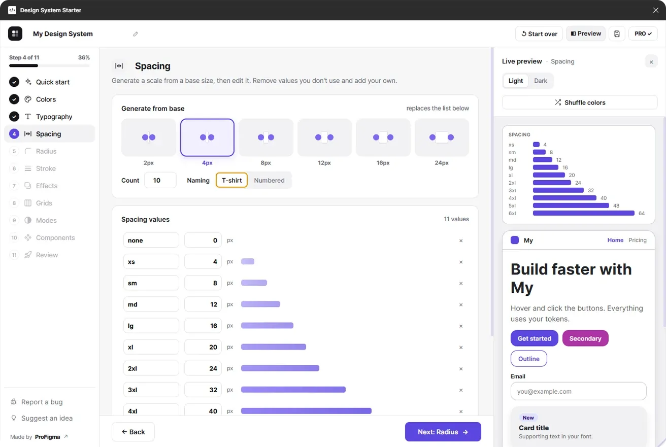
A consistent spacing scale
Generate from a 2, 4 or 8px base, name it t-shirt style or numbered, then edit, remove or add values.
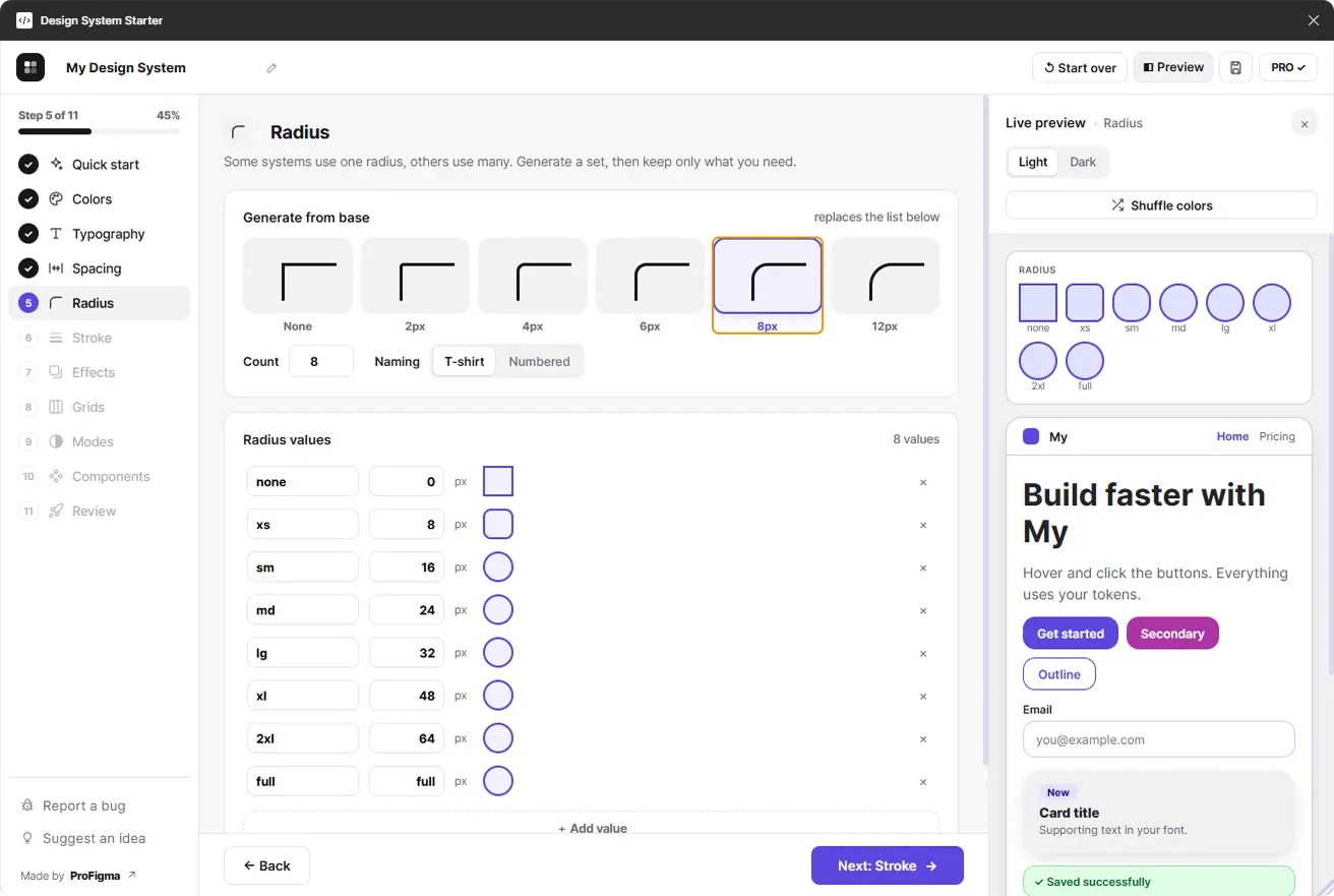
Corner radius tokens
From sharp to fully round. Every button, input and card follows your radius tokens.
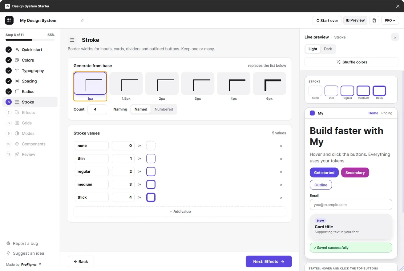
Border width tokens
Stroke tokens for inputs, cards, dividers and outlined buttons. Keep one or many.
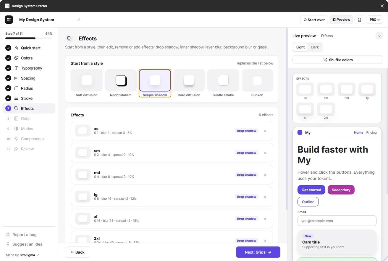
Shadows, blur and glass
Start from a style like soft diffusion or neobrutalism, then fine-tune drop shadows, inner shadows, layer blur, background blur or glass.
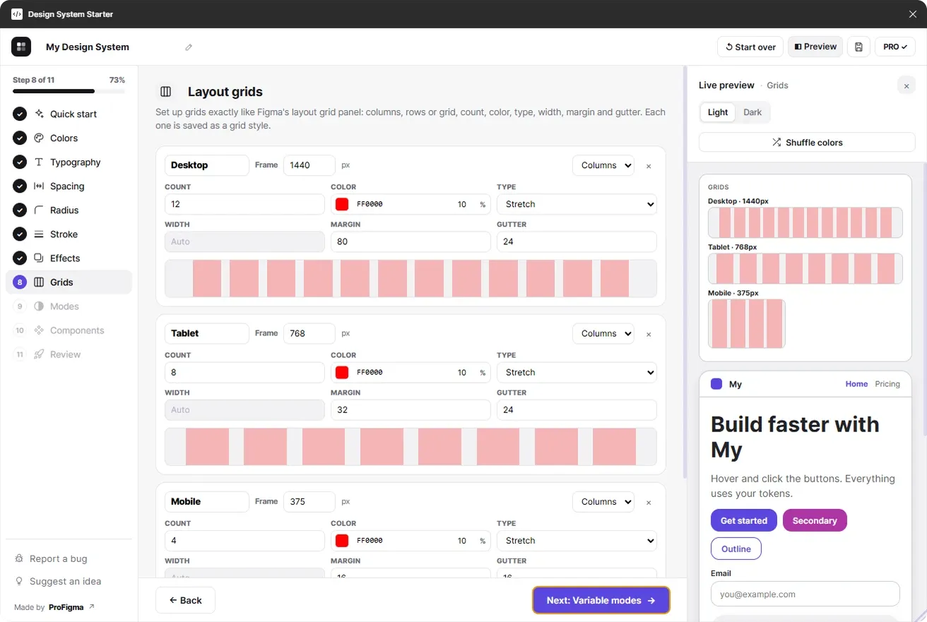
Layout grids like Figma's own panel
Columns, rows or grid, with count, color, type, width, margin and gutter, each saved as a grid style.
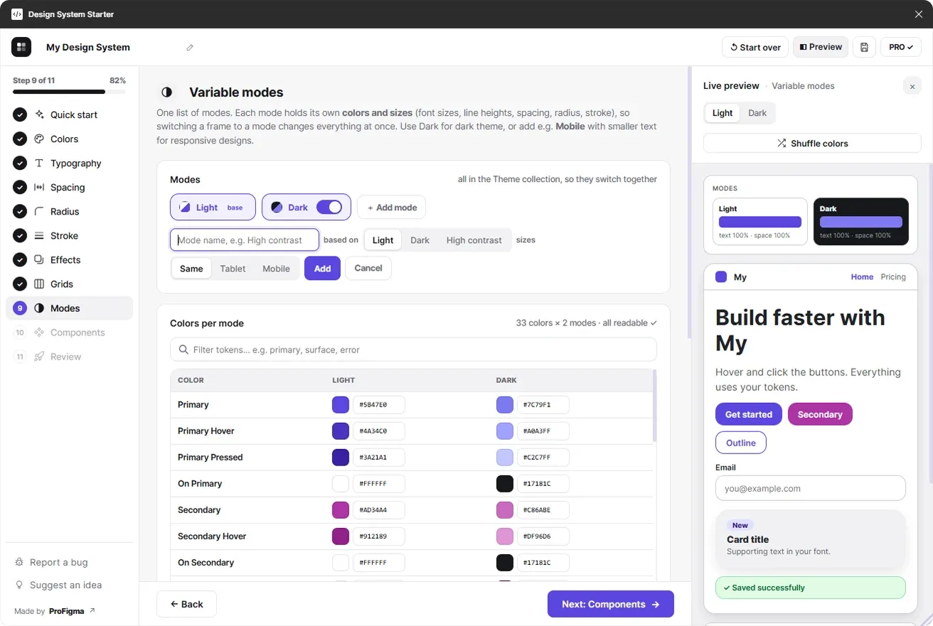
Light, Dark and custom modes
Each mode holds its own colors and sizes, so one switch changes everything. Add High contrast or Mobile in a click.
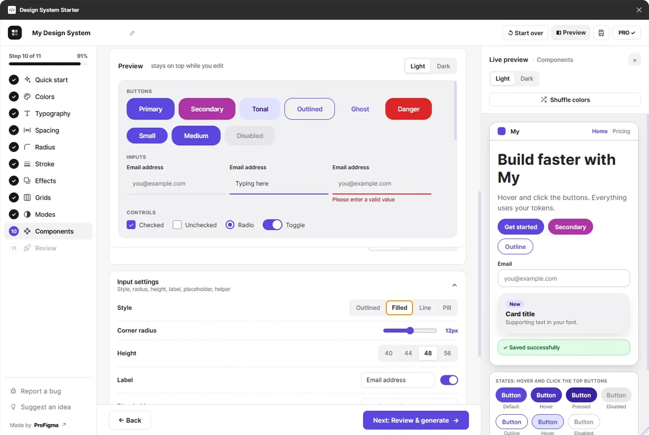
Customize 145 component variants
Tune buttons, inputs, controls and badges. Both previews update live as you change radius, height, padding, icons and style.
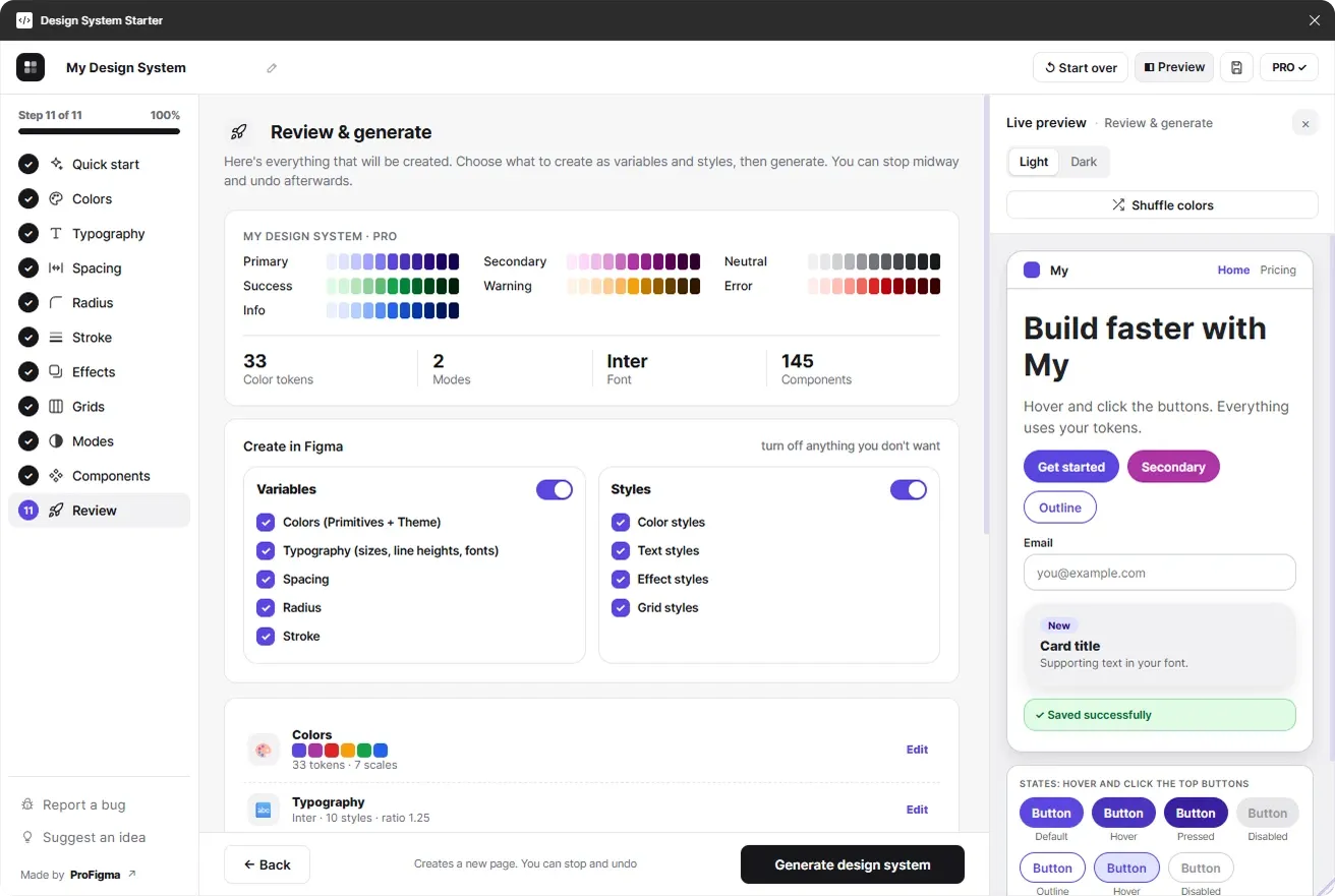
Choose what to create, then generate
Turn variables and styles on or off, check the summary and generate. Stop midway if you want, and undo afterwards.
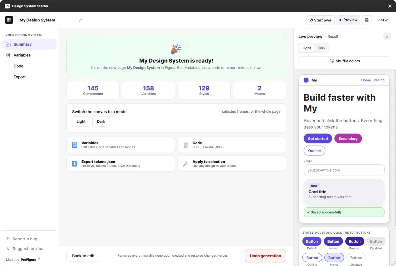
Your design system, ready in Figma
A new page with every component, style and variable. Switch the canvas between modes, edit variables, copy code or export tokens.
Primary and secondary that always look good together
Most generators pick colors at random. This one follows color-wheel rules and checks every color, so your palette is readable, balanced and on brand.
- Primary and secondary always sit clearly apart
- Every text color passes WCAG AA contrast
- Status colors tuned to match your brand
- Tested on 864 generated palettes, zero failures
Dark mode and responsive sizes, from one list of modes
Colors and sizes live together, so switching a frame to Dark or Mobile changes colors, font sizes, spacing and radius at once.
- Primitives + Theme collections, the pro way
- Text styles bound to size and line-height variables
- Components bound to radius, spacing and stroke
From blank file to design system in 4 steps
- 1
Install for free
Open Design System Starter from the Figma Community.
- 2
Generate a style
Pick an industry, a tone and a color harmony, or start from a preset.
- 3
Tweak with live preview
Walk through colors, type, spacing, modes and components.
- 4
Create in Figma
Get variables, styles and components on a new page.
Start free. Pay once, keep it forever.
No subscription. One payment covers everything, including every future update.
Free
forever
- Generate by industry & tone
- One-click presets
- Color palette with shades
- 5 text styles
- Primary button component
- Stop & undo generation
Pro
one-time payment · lifetime access · use on 5 devices
- 145 component variants
- Dark + custom variable modes
- All text styles
- Spacing, radius, stroke, effects, grids
- Import from your designs
- Variables manager
- Code + tokens.json export
- Unlimited saved systems
Questions about the Figma design system generator plugin
What does the Figma design system generator plugin create?
A complete design system inside your Figma file: color palettes with shades, theme colors, text styles, spacing, radius and stroke tokens, shadows and effects, layout grids, Light and Dark variable modes, and up to 145 component variants, all linked to Figma Variables.
Is the plugin free?
Yes. The free plan generates colors, 5 text styles and a primary button. Pro adds everything else for a one-time $9 (launch price, normally $15), with lifetime access.
Does it support dark mode and Figma Variables?
Yes. It creates Primitives and Theme variable collections with Light, Dark and any custom modes you add. Each mode holds colors and sizes, so switching a frame's mode updates everything at once.
Can I edit everything after it's generated?
Yes. Everything is created as normal Figma variables, styles and components. You can also edit values in the plugin's variables manager, and undo a whole generation in one click.
Can I export tokens for developers?
Pro exports tokens.json in W3C format (works with Tokens Studio and Style Dictionary), CSS variables for every mode and a Tailwind config. You can also import a tokens.json back into the plugin.
How do I activate Pro?
Buy Pro on Gumroad, and your license key arrives by email instantly. In the plugin, click Go Pro, paste the key and click Activate Pro. One key works on up to 5 devices.
Does the plugin send my designs anywhere?
No. Your design data never leaves Figma. The plugin only contacts Gumroad to check a license key, and our feedback form when you choose to send a message.
Your design system, ready before your coffee gets cold
Install the free Figma design system generator plugin and build your first system in about a minute.
Made by ProFigma · Questions? sales01@profigma.com
Frequently asked questions
What does the plugin create?
A design system inside your Figma file: color palettes with shades, theme colors, text styles, spacing, radius and stroke tokens, shadows, layout grids, Light and Dark variable modes, and up to 145 component variants linked to Figma Variables.
Is the plugin free?
Yes. The free plan generates colors, 5 text styles and a primary button. Pro includes the full system, including all component variants, dark mode, a variables manager and code export, for a one-time $9 payment.
Is Pro a subscription?
No. Pro is a one-time payment with lifetime access and free updates, and one key works on up to 5 devices. Checkout is handled by Gumroad and the key arrives by email.
Can developers use the output?
Yes. You can export tokens.json in the W3C format, CSS variables for every mode or a Tailwind config, and import tokens back. That keeps design and code working from the same values.
Are the colors accessible?
Colors are checked for readable WCAG contrast, and secondary colors follow color-wheel harmony such as complementary, triadic or analogous. You can still edit every color after it has been generated.