
Black Friday Sale Template That Boosts Online Sales
· 3 min read · by the ProFigma team
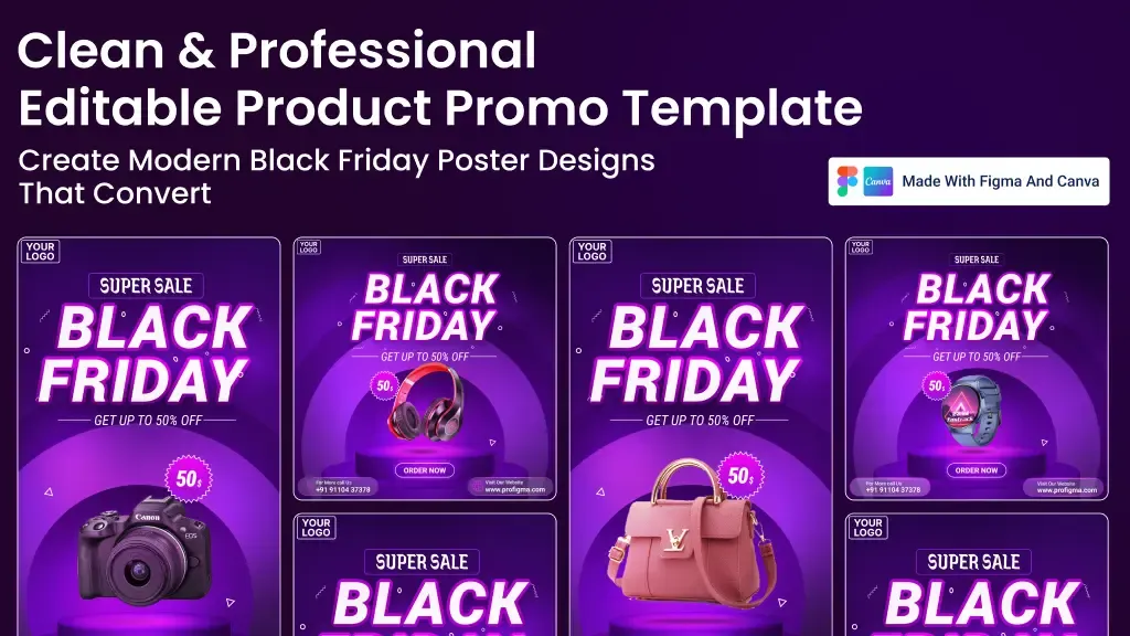
Black Friday poster design has one job: communicate the offer in a glance, in a feed full of competing sales. This guide covers headline and discount hierarchy, product placement, color contrast and the sizes you need for posts and stories. Use it to plan your sale creative, then adapt a template instead of starting from a blank canvas during a busy week.
Key takeaways
- Every Black Friday poster needs four things: the offer, the product, the deadline and one call to action.
- Dark backgrounds with bright accents set the mood, but small text must stay readable.
- Prepare a square feed post, a vertical story and a website banner from one layout.
- Keep the structure and change only the content, so the same design serves Cyber Monday and later sales.
- Check spelling, links, discount math and contrast before you publish.
The four elements every Black Friday poster needs
Shoppers decide in seconds. If a poster makes them work to understand it, they scroll on.
- The offer. This is the biggest element: "30% off", "Buy one get one", or "Everything under 999". Write the number or deal first and the explanation second.
- The product. One clear, well-lit product image, or a small group of products that belong together. A cluttered collage dilutes the message.
- The deadline. A date or time limit gives a reason to act now. Only state a deadline you will actually honor.
- The call to action. One instruction such as "Shop now" or "Order today", plus your website or handle in smaller type.
Logo and legal text (such as "terms apply") are secondary. Keep them tidy and out of the way of the offer.
Building a clear visual hierarchy
Hierarchy means the viewer's eye lands on things in the right order: offer, product, deadline, action. You create it with size, weight, color and position.
A reliable layout order
- Offer headline at the top or center, in the largest size.
- Product image large and close to the headline, so the two read together.
- Deadline in a smaller band or badge.
- Button-style call to action near the bottom.
Limit yourself to one or two typefaces and no more than three sizes of text. Strong, condensed sans-serif fonts are popular for sale posters because they stay legible when large.
Dark backgrounds and neon accents: when they work and when they hurt readability
Black backgrounds with gold, yellow or neon accents are the classic Black Friday look, and for good reason: the contrast makes products and numbers stand out. They also tie your post to the event name.
The risk is small, thin text. Light grey text on black, or neon text on a patterned background, can fail to read on a phone. Keep the main offer large and bold, put smaller text on a solid area and test contrast. Normal text should reach 4.5:1 and large text 3:1 under the WCAG AA guidelines; the WCAG color contrast checker will tell you in seconds.
If your brand is light and friendly, you do not have to go black. A bold brand color with white text can work just as well, provided the offer is obvious.
Sizes for feed posts, stories and website banners
Plan all the formats at the start, since reformatting at the end rarely looks good.
- Feed post: 1080 x 1080 px square works on most platforms.
- Story or status: 1080 x 1920 px vertical. Keep text and buttons away from the top and bottom edges where app interface elements sit.
- Website banner: a wide format, sized to your store theme's hero area. Check your platform's recommended dimensions.
Build the square version first, then adapt it. Stories need the same elements stacked vertically, with more room around the product. Compress exported images with the image compressor for product photos so your store banner loads quickly.
Reusing one layout for Cyber Monday and later sales
Black Friday falls the day after US Thanksgiving, and Cyber Monday follows on the Monday after. Instead of designing twice, build a layout where only the headline, discount text, product image and dates change. Keep colors, fonts and positions fixed.
The same structure then covers festival sales, end-of-season clearances and new product launches. Save the master file somewhere safe and duplicate it for each campaign, rather than editing the original.
Add a QR code when the poster is printed
For in-store posters, flyers or packaging inserts, a QR code can send people straight to the sale page. Generate one with the QR code generator for sale posters, add a short label such as "Scan for today's offers", leave a clear margin around it and test it from the distance people will scan from.
A pre-publish checklist: spelling, links, discount math and contrast
- Spelling and product names. Read the poster aloud, then have someone else read it.
- Discount math. Confirm that "up to 50% off" is true for at least some products, and that percentages and prices agree.
- Dates and time zones. Make sure the end time matches your store settings.
- Links and QR codes. Click and scan them on a phone.
- Contrast and size. View the poster at phone size and confirm everything is readable.
- Rules. Check that your discount wording meets advertising or consumer rules where you sell.
Mistakes to avoid
- Too many offers at once. Promote one headline deal per poster and send the rest to the website.
- Vague urgency. "Hurry!" means little. A real end date is more convincing.
- Low-quality product images. Blurry or heavily compressed pictures weaken trust.
- Starting late. Prepare creatives a week or two ahead so you can test them and fix errors.
Conclusion
A strong Black Friday poster is simple: a big offer, one product, a real deadline and a single action. Build a flexible layout, prepare the square and story sizes together and check every detail before launch. Then reuse the same structure for Cyber Monday and your next sale.
To skip the layout work, try the Black Friday sale template for Figma and Canva, which comes in a square post size and a vertical story size, and replace the product, text and logo with your own.
FAQ
What should a Black Friday poster include?
The offer in large type, a clear product image, the end date or time limit, your logo and one call to action such as Order now. Keep contact or website details readable but secondary.
What size should a Black Friday social media post be?
A 1080 x 1080 px square works for most feeds, and 1080 x 1920 px works for stories and status updates. Prepare both sizes from one design so the offer looks consistent.
Are dark designs good for Black Friday?
Dark backgrounds with bright accents create a strong sale mood, but small text can become hard to read. Keep the main offer large and check text contrast before you publish.
Can I reuse the same template for other sales?
Yes. Change the headline, discount text and product image and the same layout works for Cyber Monday, festival sales or any seasonal promotion. Keep the structure and only edit the content for each campaign.
Can small businesses design sale posts without a designer?
Yes. Editable Figma or Canva templates let you replace the product, logo and text yourself. Keep the structure and change only the content to maintain a professional look.