How to use it in Figma, even if you have never used Figma
Four steps. You do not need to draw anything, and a free Figma account is enough (Pro components need a ProFigma Pro plan).
Fill
Export
- Press Copy to FigmaClick the button on this page. The design is copied, like text you copy with Ctrl + C.
- Paste it in FigmaOpen Figma, open any file and press Ctrl + V (Cmd + V on Mac). You get real, editable layers.
- Make it yoursDouble-click a text to type your own words. Click a shape and change its color under Fill. Drag your own photo onto an image box.
- Export itClick the design. In the right panel, scroll to Export, choose PNG, JPG, SVG or PDF, then click Export.
Tip: install the free Google Fonts used in the design (the name shows when you click a text) so the text looks the same on your computer.
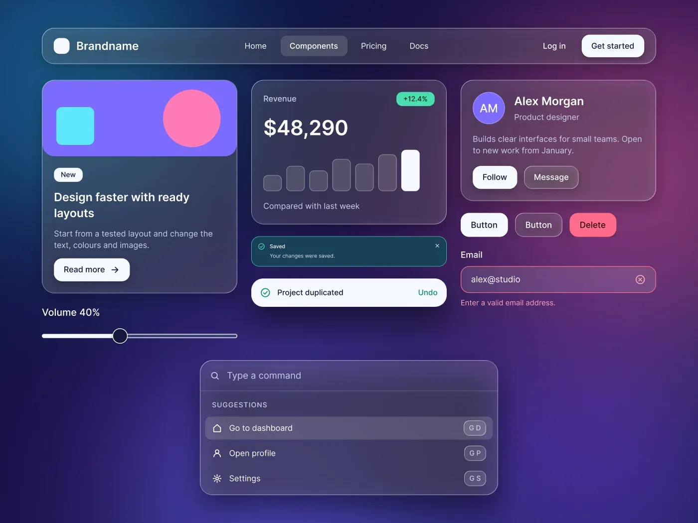
This glassmorphism ui kit uses the Glass effect in Figma on cards, fields, the navbar and the modal, over a deep blue and violet gradient with soft glowing shapes.
What is included
- White and glass buttons with ghost and danger variants in five states and three sizes
- Glass text fields, textarea, select menu, checkbox, radio, toggle and slider
- Content, stat and profile cards, four tinted alerts, a toast and a modal
- A navbar, a command palette and a settings list on frosted panels
- Tabs, breadcrumb, pagination, avatars and an accordion
Where to use it
Use it for music and media apps, finance dashboards, landing pages and mobile screens that sit over rich backgrounds.
Design notes
Glass fills are 12 to 14 percent white with a 14 px frost, a thin light border and a soft shadow. The glow shapes use a layer blur of 400 so colors blend without edges. Text is white and light lilac. Test contrast on your own backgrounds, because glass changes with what sits behind it. The kit needs a Figma version that has the Glass effect.
Built for editing
Spacing sits on a 4 point grid and layers have clear names. Fonts are free on Google Fonts (Inter) and every color is a fill you can change in the fill panel. Text sizes stay at 12, 14, 16, 20 and 36 px, so the scale is easy to follow.
How to use it
Copy the kit with the copy button and paste it into Figma with Ctrl+V or Cmd+V. The layers keep their auto layout, so you can edit text, colors and spacing. Install the free Google Fonts first so the text looks the same.