How to use it in Figma, even if you have never used Figma
Four steps. You do not need to draw anything, and a free Figma account is enough (Pro components need a ProFigma Pro plan).
Fill
Export
- Press Copy to FigmaClick the button on this page. The design is copied, like text you copy with Ctrl + C.
- Paste it in FigmaOpen Figma, open any file and press Ctrl + V (Cmd + V on Mac). You get real, editable layers.
- Make it yoursDouble-click a text to type your own words. Click a shape and change its color under Fill. Drag your own photo onto an image box.
- Export itClick the design. In the right panel, scroll to Export, choose PNG, JPG, SVG or PDF, then click Export.
Tip: install the free Google Fonts used in the design (the name shows when you click a text) so the text looks the same on your computer.
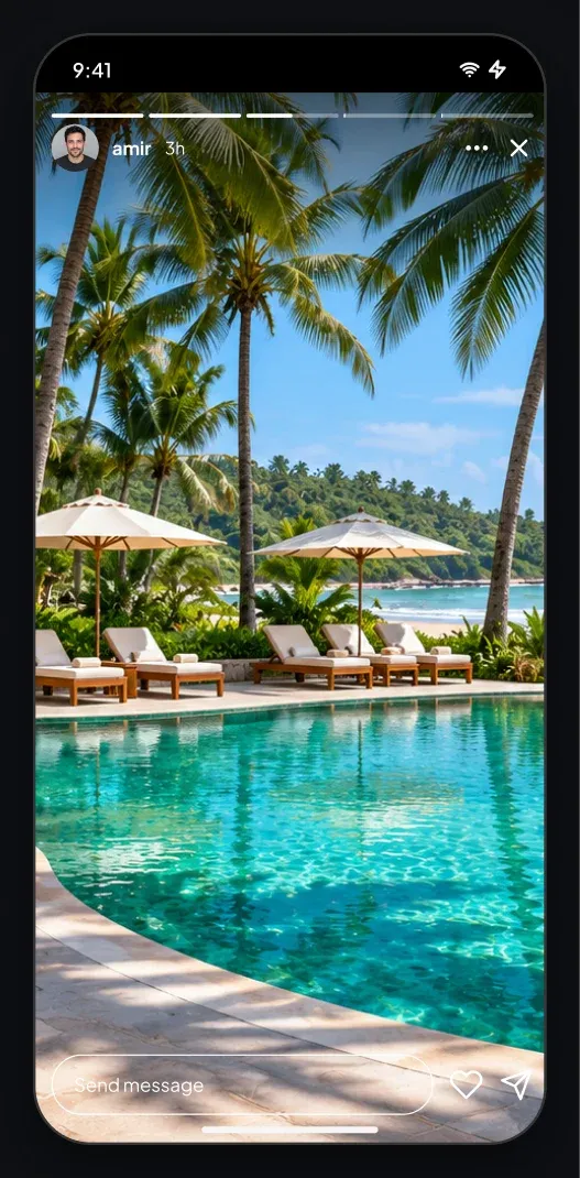
This social story viewer app UI for Figma shows a story viewer with progress bars, a user header, a full height photo and a reply box.
What is included
- Five progress bars where finished stories are full and the current one is half
- A header with avatar, name, time, more and close icons
- A full height photo area
- A reply field with heart and send icons
- Previous and next arrows on larger screens
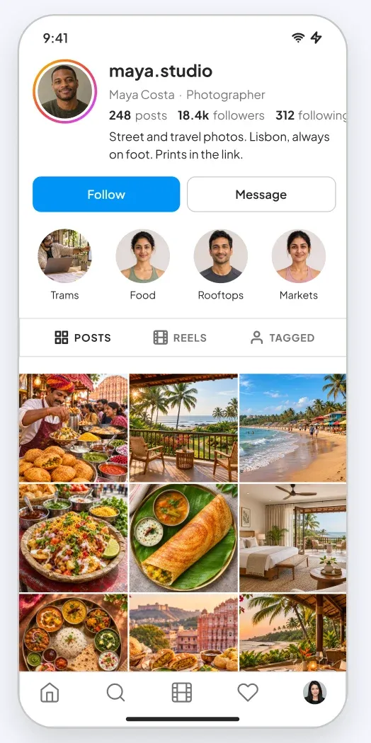
- The app screen is 390 by 844 px with a status bar, a home indicator and a tab bar where the screen has one
Where to use it
Use it for story features, event apps, news apps and any product with short lived photo or video updates. It is made for iOS and Android app UI.
Design notes
The progress bars use white on a dark shade at the top. The reply field has a thin white outline instead of a fill, so the photo stays visible. It uses a dark theme: near-black cards, light text and the same pink and blue accent, so it reads like a real app screen rather than a wireframe.
Built for editing
Spacing follows a 4 point scale and layers have clear names, so developers can find what they need. Every color is a fill you can change in the fill panel, and the whole screen uses auto layout. Text pairs stay above 4.5 to 1 contrast, except white text that sits on a photo.
How to use it
Copy the component with the copy button and paste it into Figma with Ctrl+V or Cmd+V. This is the Dark version. Photo spots are rectangles with a real sample picture already placed as a fill, so you can swap in your own picture in one click. Install the free Plus Jakarta Sans font first. All names, handles and numbers are sample content.