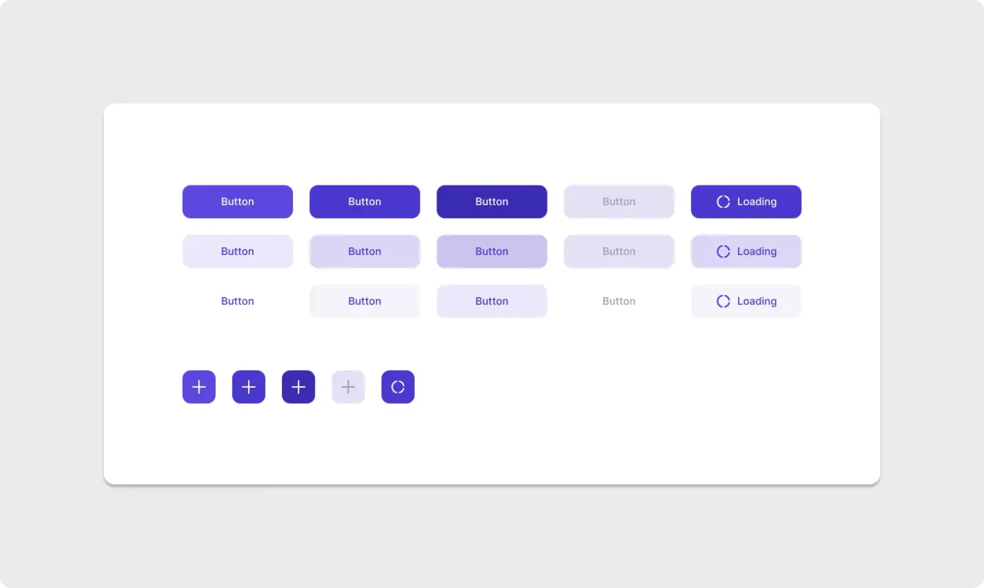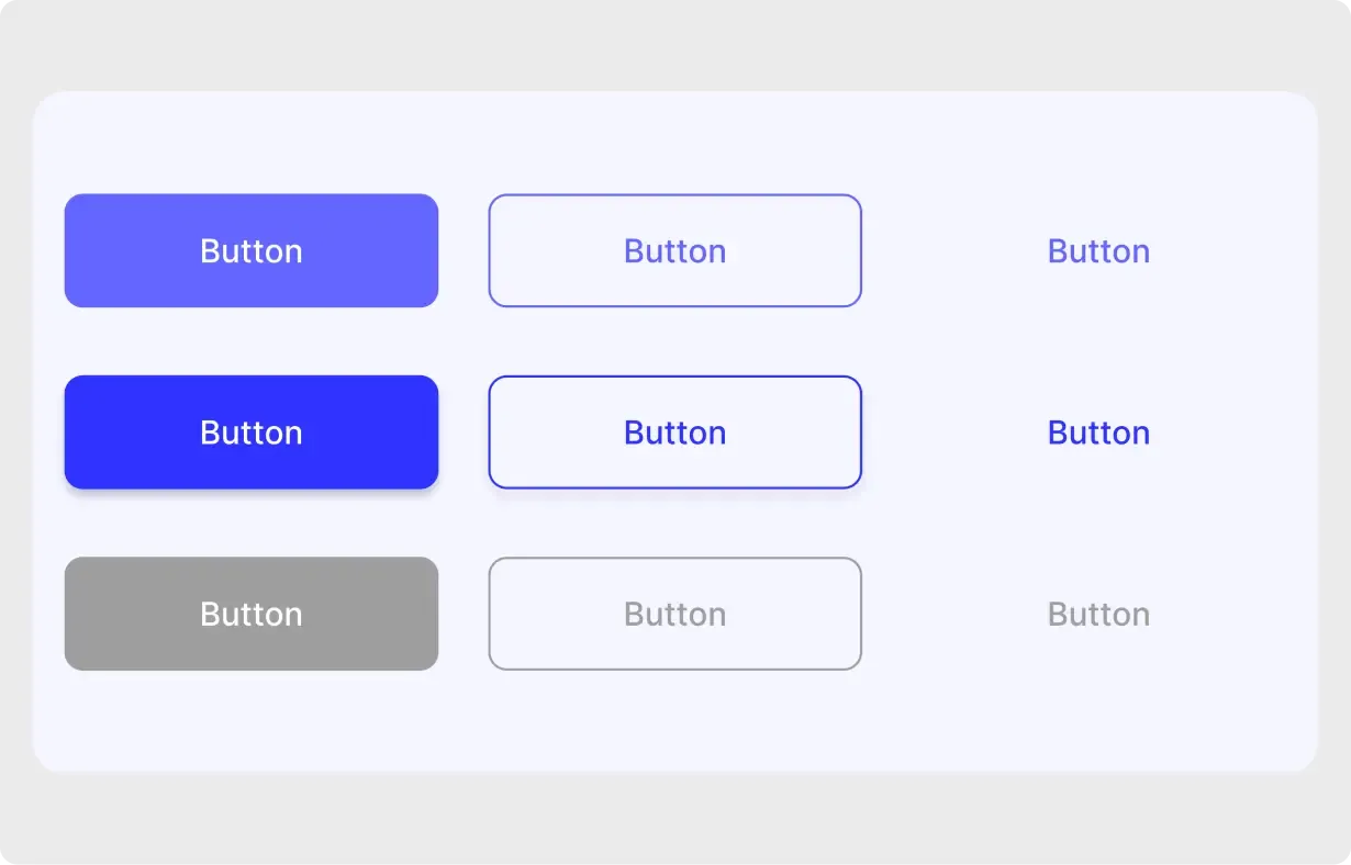
This Figma button component set gives you three button styles in three states, laid out in a neat grid. It is a quick way to start a design system or tidy up a prototype.
Buttons are used on almost every screen, so small differences add up quickly. This set puts the three most common styles side by side with the three states people need, which makes gaps easy to spot. The soft violet range is friendly and works on a white or pale background. It is a useful reference for anyone building a first design system. Because the states sit together, it is also handy for checking that your disabled style is clearly different from the default.
What you get
- Three columns: filled, outlined and text-only buttons
- Three rows: default, active or hover and disabled states
- A soft violet to blue colour range
- Rounded corners and clear centred labels
- A pale card background that keeps the focus on the buttons
How to use it in Figma
Press copy on this page and paste into Figma with Ctrl or Cmd + V. Turn the buttons into your own components, set your brand colour and text style, and use them across your screens. Variants help you keep states in one place.
Best for
- New design systems and style guides
- Web apps and dashboards
- Prototypes that need consistent actions
- Teaching examples for button states
Customisation tips
- Change the main colour first, then check the disabled state still looks clearly off.
- Keep one filled button per screen for the main action.
- If you want an extra icon or loading style, try the button component UI kit. See all Buttons and Cards.