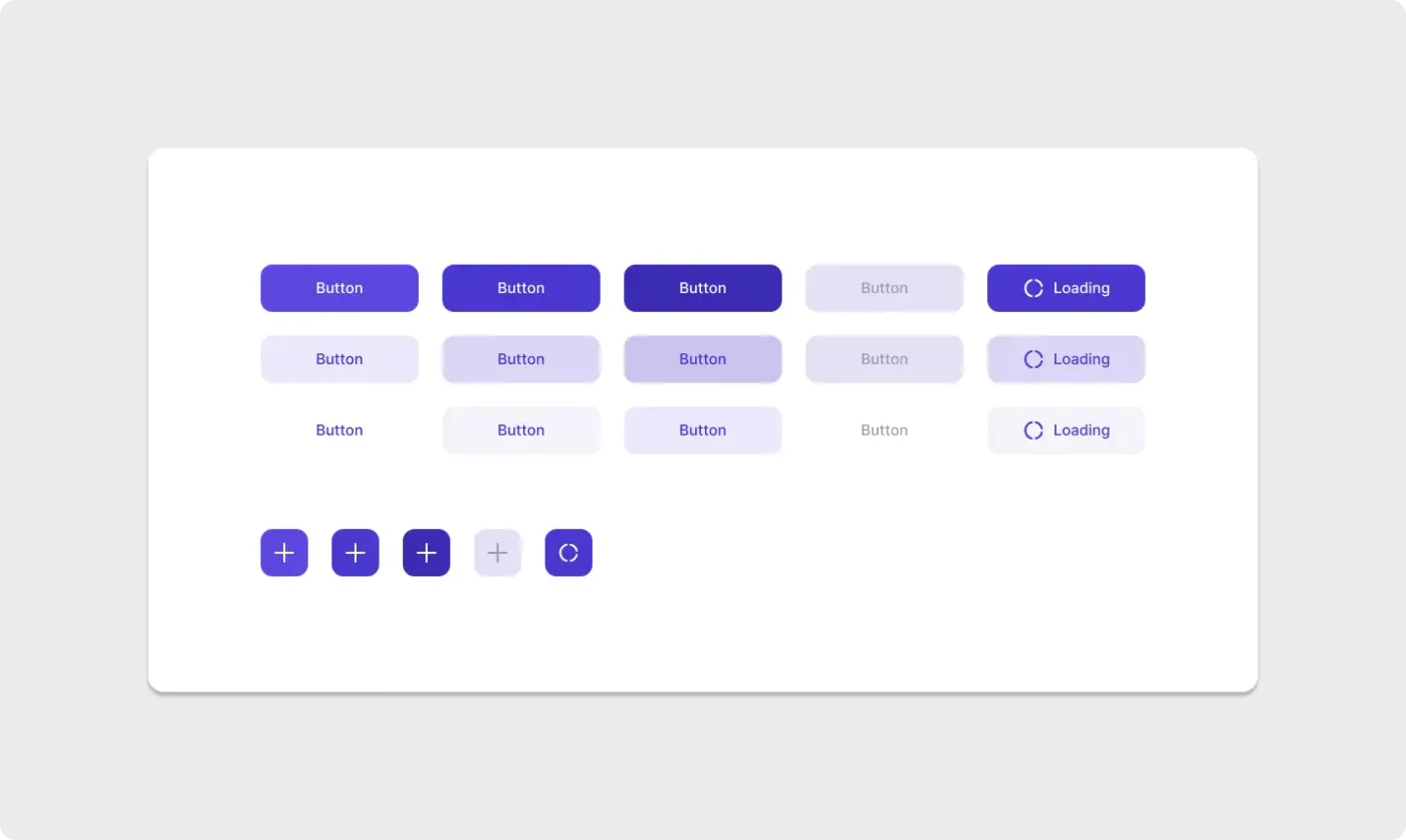
This Figma button component UI kit covers a wider set of states than most starter packs. Each row shows one style, and each column shows one state, from default to loading.
Real products need more than a default button. This kit shows hover, pressed, disabled and loading states for three styles, which helps developers see exactly what to build. The icon buttons at the bottom cover compact actions such as add or refresh. Having every state on one sheet makes reviews faster and keeps the design consistent. It also makes a clear reference sheet to share with a developer who needs to know every state before building.
What you get
- Three styles: solid violet, soft tint and text only
- Five states per style: default, hover, pressed, disabled and loading
- A spinner icon on the loading buttons
- A row of square icon buttons with a plus sign and a loading version
- A white panel that keeps everything easy to compare
How to use it in Figma
Click copy and paste into Figma with Ctrl or Cmd + V. Turn each button into a component, group the states as variants and connect your colours and text styles. Then use instances across your screens.
Best for
- Design systems and component libraries
- Web apps with forms and actions
- Handoff files that must show every state
- Teams standardising their UI
Customisation tips
- Name states clearly so developers can map them to code.
- Make the disabled button lighter, but keep the label legible.
- Need a simpler start? Use the button component set. Check label contrast with the WCAG colour contrast checker.