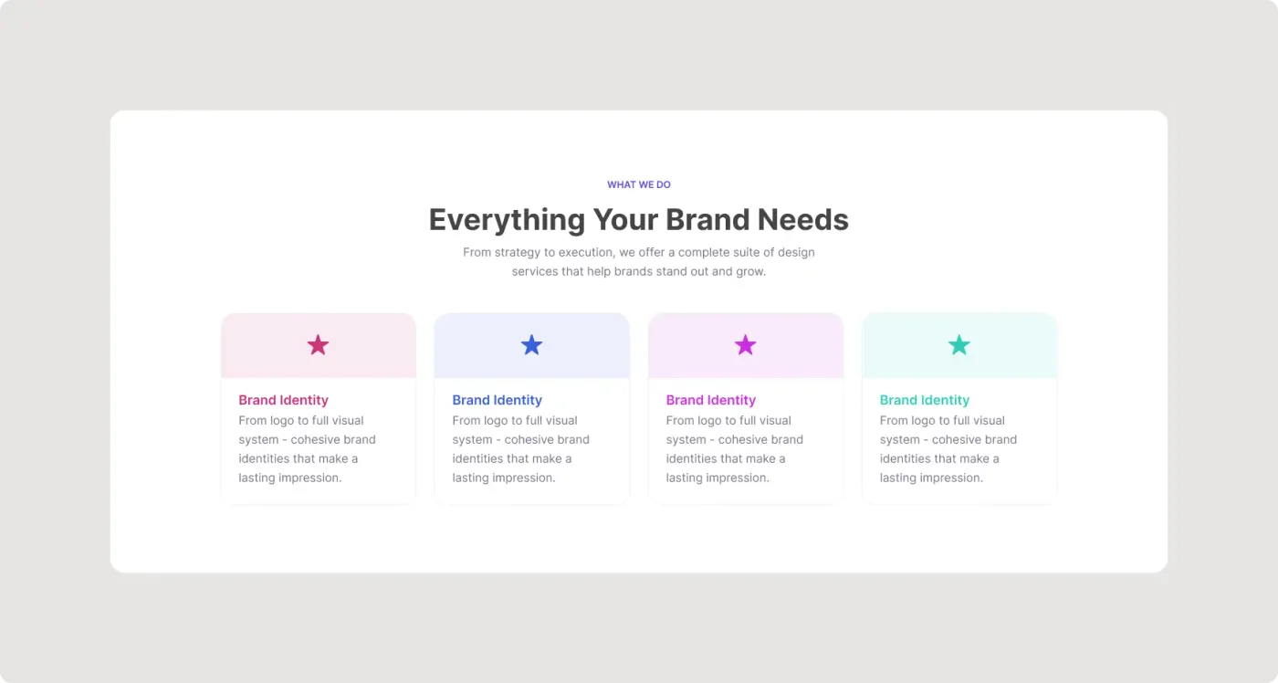
This service cards UI is a compact row of four cards with a tinted header strip and a star icon. It works well when you have a short list of main services.
When you only have a few services, fewer and larger cards read better. This version places four cards in one row with a coloured header strip and a short description beneath. The matching title colour gives each card its own identity while the grid stays orderly. It fits well under a hero section or inside a long landing page. The simple structure also makes it easy to turn into a component, so you can reuse it on several pages. More card layouts are in Buttons and Cards.
What you get
- A "What we do" label, a heading and an intro line
- Four equal cards in a single row
- A tinted top band on each card in pink, blue, violet or teal
- A coloured title that matches the band and a three-line description
- A white panel that keeps the cards in focus
How to use it in Figma
Press the copy button, then paste into Figma with Ctrl or Cmd + V. Swap the stars for your own icons, rewrite the titles and set the colours to your palette. Make the cards wider or narrower as needed.
Best for
- Homepage service overviews
- Landing pages for agencies and consultants
- Pricing or plan intros
- Feature summaries in pitch decks
Customisation tips
- Keep the title to two words or fewer.
- Match the title colour to the card band for a cohesive look.
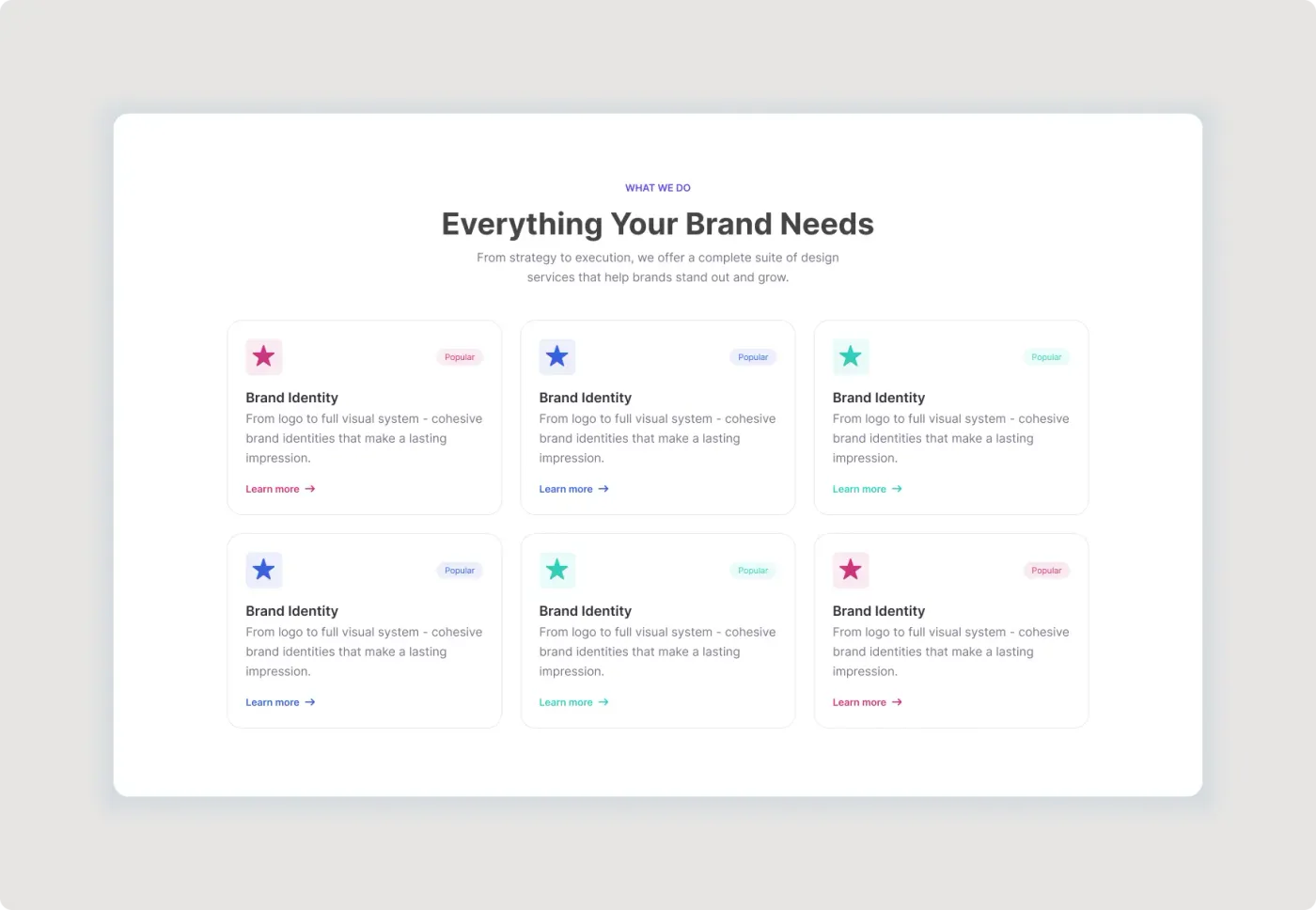
- Need six items? Use the services section with six cards.