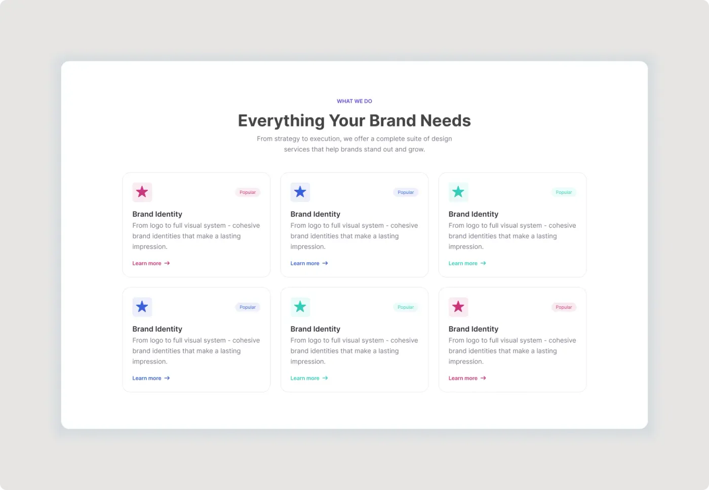
This services section UI Figma layout is a tidy six-card layout for agencies and studios. A short heading and intro sit above the cards, and each card has a coloured accent.
A services section helps visitors decide quickly whether you can help. This layout uses equal cards with a title, a line of detail and a link, so people can scan the options and click the one that matters to them. The three accent colours add variety, and the white panel keeps the section calm and clean. Use the Popular tag sparingly, so it points to the services you most want people to explore.
What you get
- A small "What we do" label, a heading and a two-line intro
- Six cards in a three-by-two grid
- A tinted square icon on each card, in pink, blue or teal
- A Popular tag, a title, a short description and a matching Learn more link
- A white panel with generous space around the grid
How to use it in Figma
Click copy on this page and paste into Figma with Ctrl or Cmd + V. Replace the icons, titles and text, then change the accent colours. Add or remove cards to match your service list.
Best for
- Agency, studio and freelancer websites
- Consulting and creative services
- Product feature overviews
- Homepage mockups for clients
Customisation tips
- Write each card in the same length so the grid stays even.
- Only tag the services you really want to highlight.
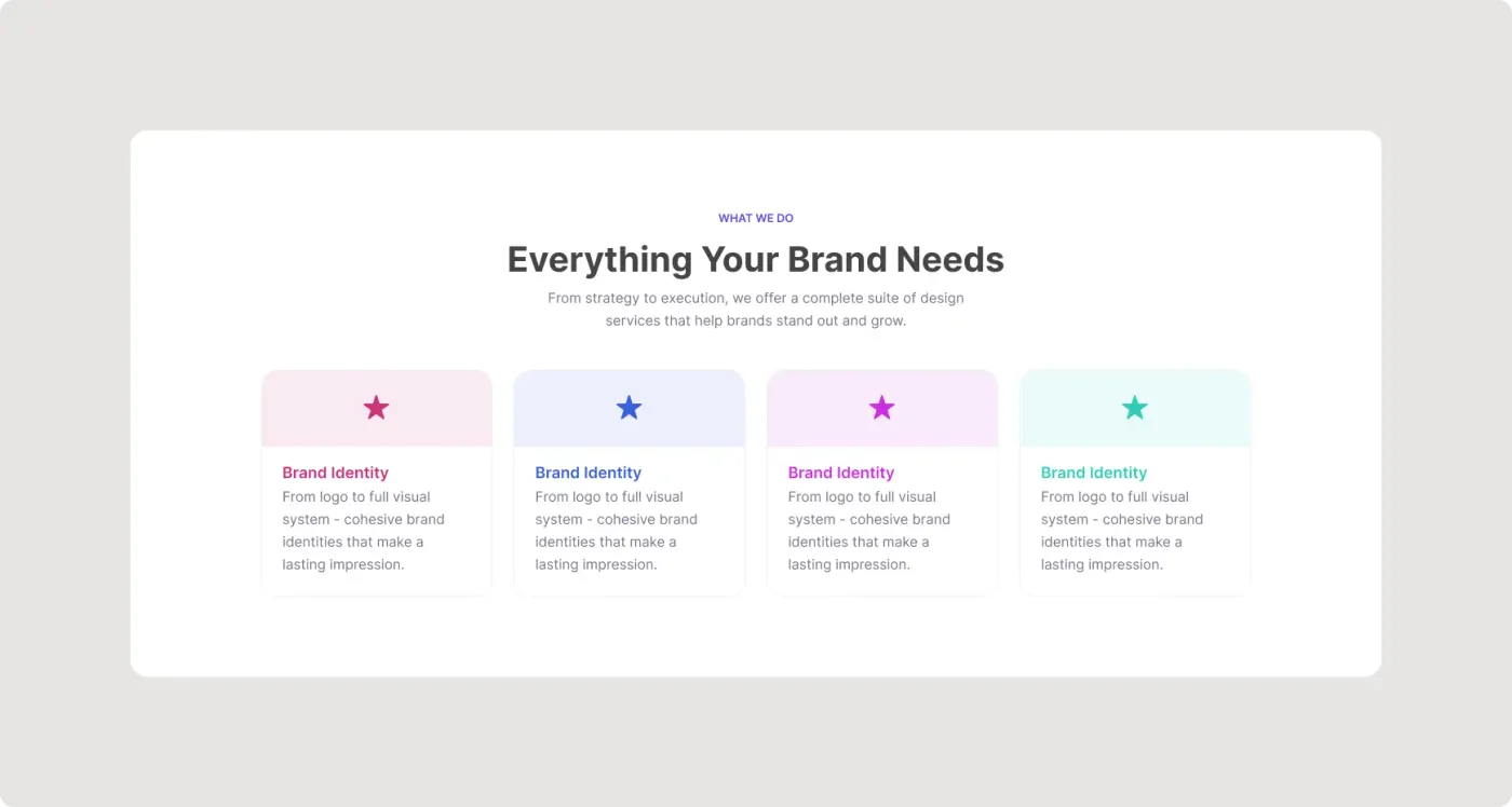
- For a shorter, four-card style, see the brand services cards. Browse more in Buttons and Cards.