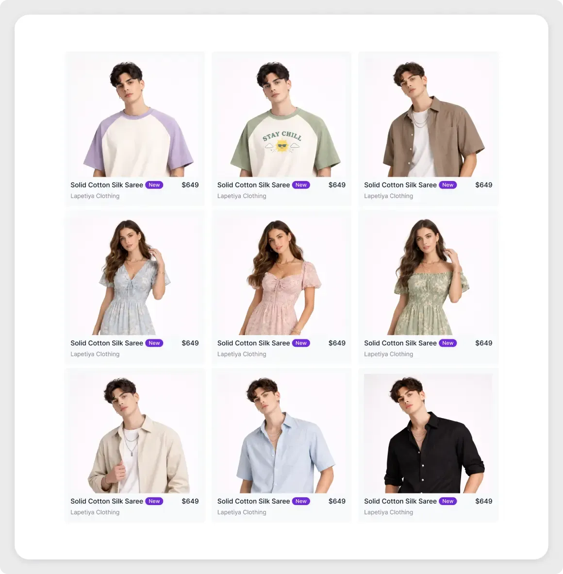
This e-commerce product grid UI is a clean three-by-three layout for a clothing shop. Each card shows a product photo, a name, a brand line, a price and a small purple New badge.
Shoppers scan a product grid quickly, so each card must be easy to read. Here every card follows the same pattern: image first, then name, price and brand. The small New tag adds a hint of colour without distracting from the photo. The even spacing makes the whole page feel organised, which is helpful when a catalogue grows. You can reuse the card as a component, so adding a new product only takes one copy and a change of text.
What you get
- Nine product cards on a white rounded panel
- Model photos on a soft background
- A product name with a purple New tag and a price on each card
- A grey brand line under each name
- Even gutters between rows and columns
How to use it in Figma
Click the copy button, then paste into Figma with Ctrl or Cmd + V. Replace the photos and text with your products. The prices and names in the demo are placeholders, so change every card. You can add or remove cards to change the grid.
Best for
- Fashion and lifestyle shops
- Category and collection pages
- Marketplace and catalogue mockups
- Store redesign proposals
Customisation tips
- Use photos of the same size and background for a tidy grid.
- Keep names to one line so cards stay aligned.
- For a darker, image-led layout see the dark mode portfolio grid. Compress product photos with the image compressor to keep pages quick.