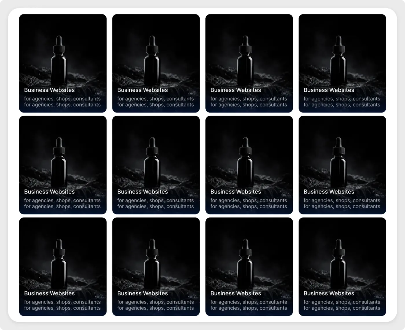
This dark mode portfolio grid UI is a four-by-three set of tall cards with dark photos and text laid over the bottom. It suits creative work that looks best against a dark background.
A grid of equal cards makes a body of work easy to browse. These tall cards place the title and description over a dark gradient, so the image fills the frame. The rounded corners and even gaps keep the layout tidy, and the dark palette suits products, photography and brand work that benefits from a moody background. Change the number of columns or rows to fit your own work, and keep the spacing the same for a balanced look.
What you get
- Twelve rounded cards on a white panel in four columns
- A dark product image on every card
- A bold title and a short description laid over a gradient at the bottom
- Equal spacing between all cards
How to use it in Figma
Press copy on this page, then paste into Figma with Ctrl or Cmd + V. Replace the image on each card, then rewrite the titles and descriptions. The demo repeats the same image and text on every card, so change each one.
Best for
- Portfolios and case study indexes
- Agency service lists
- Product and gallery pages
- Photography and brand pages
Customisation tips
- Pick images with a dark base so the white text stays readable.
- Keep titles short and descriptions to two lines at most.
- Use the UI grid maker to plan column widths first. For a light, shop-style grid, see the e-commerce product grid.