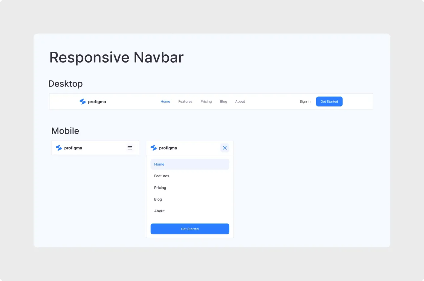
This Figma responsive navbar shows one navigation pattern in three views, so you can design the desktop and mobile versions together.
Navigation changes a lot between a wide screen and a phone. This layout puts the desktop bar and both mobile states on one board, so you can see how the logo, links and main button move. The open mobile menu keeps the same order of links, with the main action pinned at the bottom for easy reach with a thumb. Use it as a reference when you explain the mobile behaviour to a client or a developer.
What you get
- A desktop bar with logo, five links, a Sign in link and a Get Started button
- A mobile bar with a logo and a menu icon
- An open mobile menu with a close icon, a highlighted Home link and a full-width Get Started button
- Clear section titles for Desktop and Mobile on a light background
How to use it in Figma
Press the copy button and paste into Figma with Ctrl or Cmd + V. Replace the links and logo, then adjust colours. Use the three views as a base for your own components and prototype the open and close action between the mobile frames.
Best for
- Marketing sites and SaaS products
- Responsive design handoff
- Portfolio and agency websites
- Teaching examples for mobile menus
Customisation tips
- Keep the menu to five links or fewer.
- Make the active link obvious with colour, not just weight.
- For a header with a contact strip, see the website header design. Browse more in Headers and Navbars.