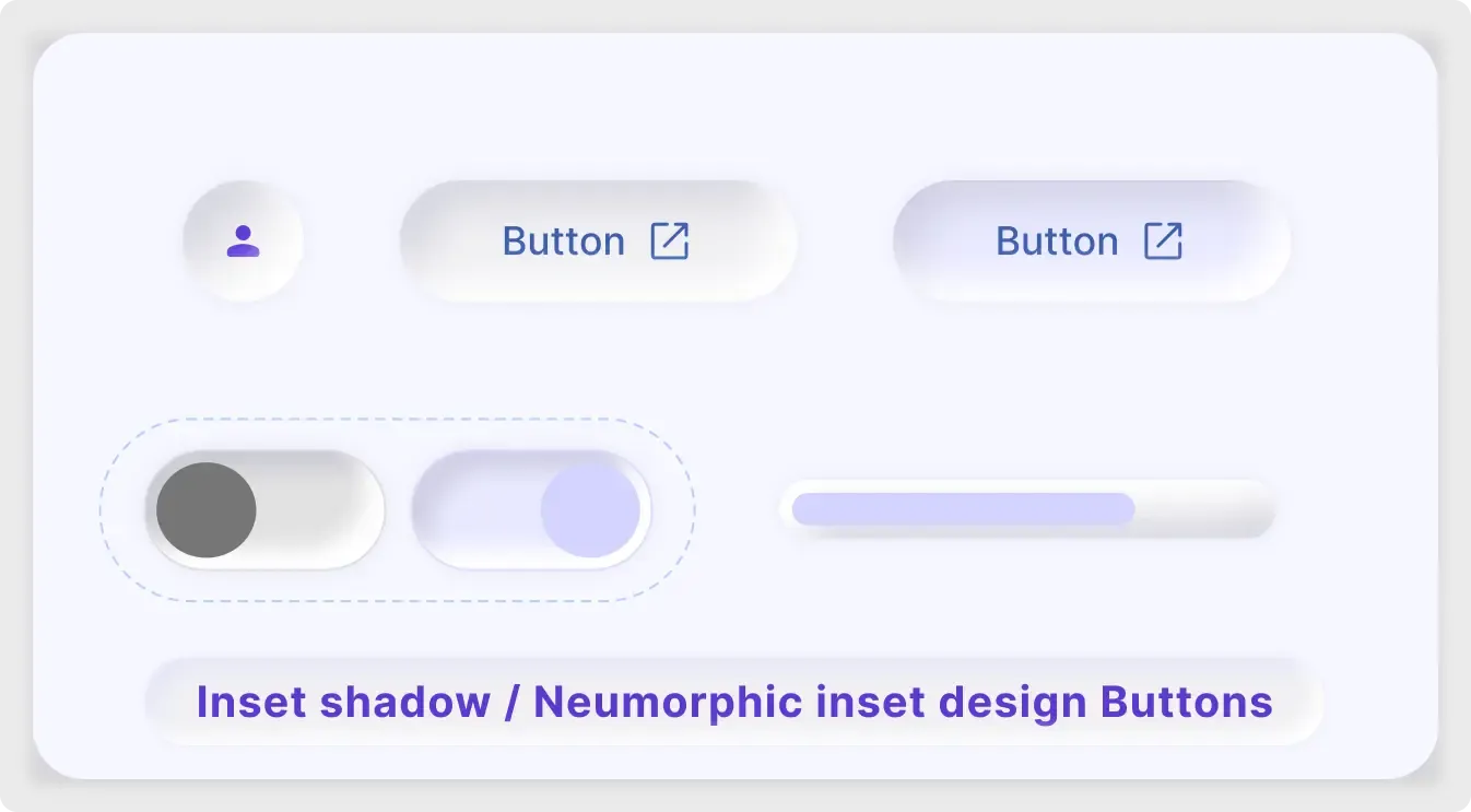
This neumorphic button UI kit shows the inset side of the soft style. Controls look pressed into the surface, with gentle shadows and a lavender accent.
Neumorphism is a style where controls look like they grow out of the surface, and the inset version looks pressed in. This kit shows how that works for buttons, toggles and a slider, using light shadows and a single lavender accent. It is a good way to test whether the style suits your product before you commit to a full interface. Try it on a few screens and see whether the soft shadows still read clearly on real devices.
What you get
- Pill-shaped buttons with an external-link icon
- A round icon button with a user symbol
- A pair of toggle switches in off and on states inside a dashed outline
- A progress slider with a lavender fill
- A caption bar that names the style: inset shadow neumorphic buttons
How to use it in Figma
Click copy, then paste into Figma with Ctrl or Cmd + V. Shadows come as effects on the layers, so you can adjust blur and offset to fit your background. Keep the background close to the button colour for the soft look.
Best for
- Smart home and device control interfaces
- Music, wellness and finance app mockups
- Dribbble-style concept shots
- Style exploration before choosing a direction
Customisation tips
- Increase contrast on labels. Neumorphism can feel faint, and text must stay readable.
- Use the accent colour only for active states.
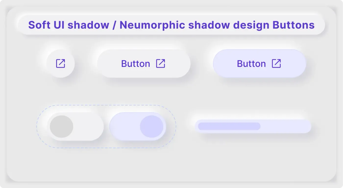
- For a raised look, try the soft UI button components. A bolder option is the brutalism button kit.