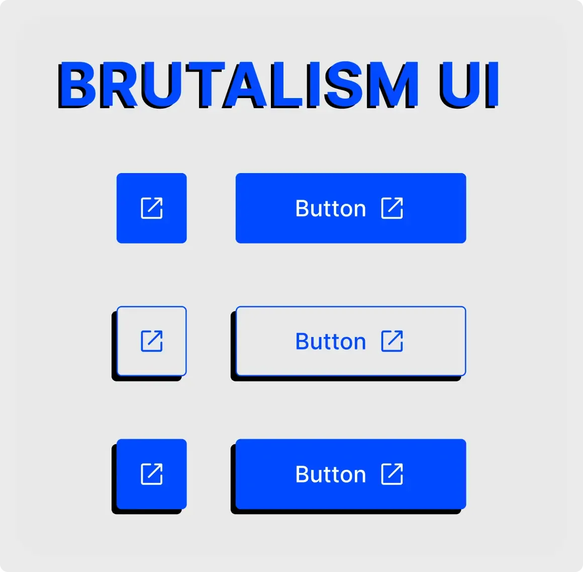
This brutalism button UI kit is the opposite of soft UI. It uses flat blue, sharp rectangles and thick black offset shadows to make every button stand out.
Brutalist design drops softness on purpose. Corners are sharp, colours are flat and shadows are solid black, which makes every control feel firm and easy to spot. This kit shows the style on square icon buttons and wide labelled buttons. It is a fast way to try a bolder direction before you commit to it for a whole site. Pair it with large type and plain white space, and the whole page will feel consistent with these buttons.
What you get
- A large "BRUTALISM UI" title in blue with a black drop shadow
- Square icon buttons and wide labelled buttons with an arrow icon
- Three rows: plain filled, outlined with a shadow and filled with a shadow
- A light grey canvas that lets the blue and black stand out
How to use it in Figma
Click copy and paste into Figma with Ctrl or Cmd + V. Change the blue to your brand colour and keep the black shadow offset the same on every button. Consistency is what makes this style look deliberate.
Best for
- Creative studios and portfolios
- Indie products and landing pages
- Event and music sites
- Brands that want a bold, direct tone
Customisation tips
- Keep text large and short. Brutalist pages work best with few words.
- Use one accent colour and let black do the rest.
- For a gentler style, compare the soft UI button components. A tidier, more neutral choice is the button component set.