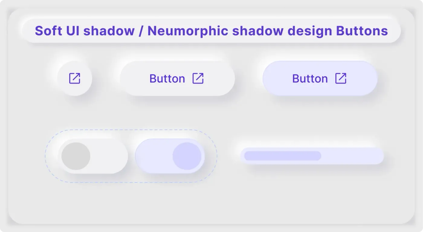
These soft UI button components show the raised side of neumorphic design. Buttons seem to rise from the surface, lit from the top left with a light and a dark shadow.
Soft UI works through light. A pale highlight on one side and a darker shadow on the other make each control look raised. This set shows that effect on a round button, pill buttons, toggles and a progress bar, with lavender as the only accent. It is a good starting point if you want a gentle, tactile feel in a prototype.
What you get
- A round icon button and two pill buttons, one in lavender
- A pair of toggles, one off and one on, in a dashed frame
- A progress bar with a lavender fill
- A title pill that reads Soft UI shadow neumorphic design buttons
- A light grey surface with soft edges
How to use it in Figma
Press the copy button and paste into Figma with Ctrl or Cmd + V. Select a button to see its shadow effects, then change the colour of the surface and the buttons together. Both must stay close in tone for the style to work.
Best for
- Dashboards with a calm, tactile feel
- Music players and smart devices
- Concept designs and portfolio shots
- Experiments with new UI styles
Customisation tips
- Limit the style to a few controls. Too much softness makes it hard to see what can be pressed.
- Check text colours with the WCAG colour contrast checker before you ship.
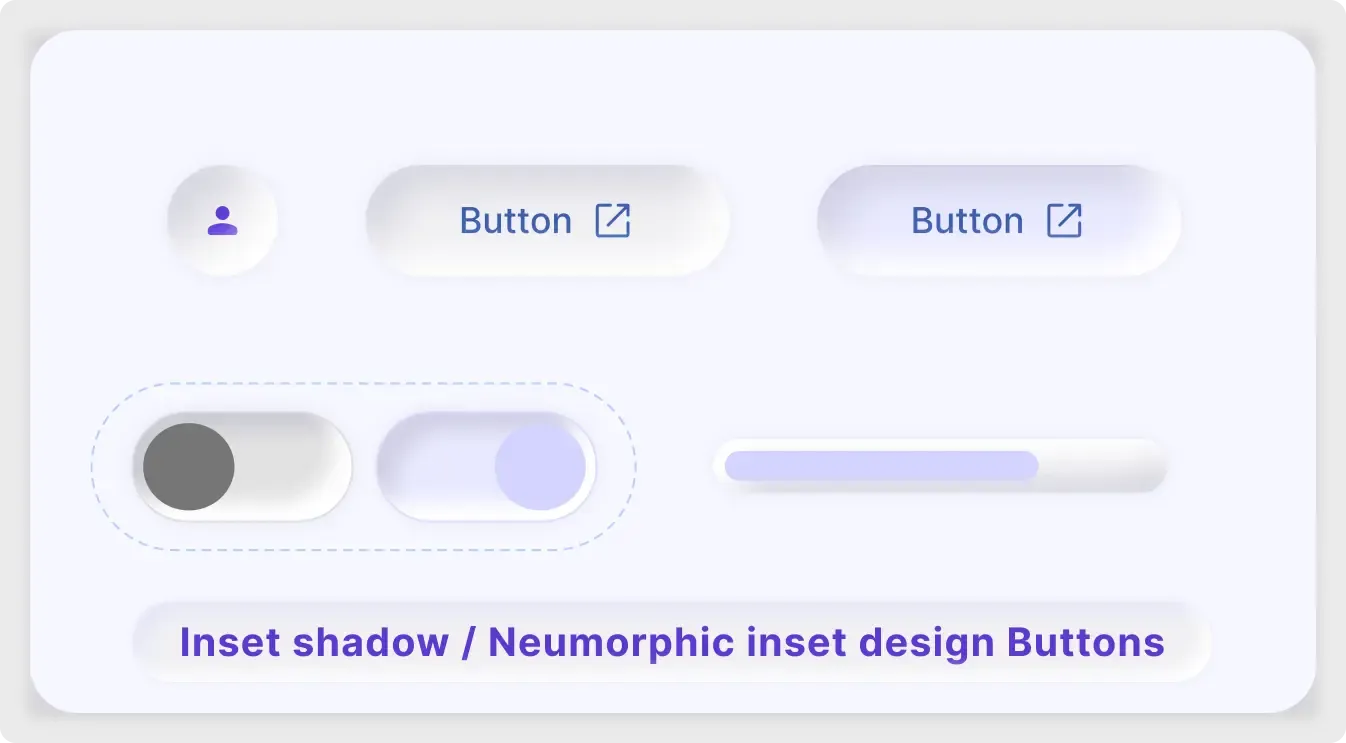
- Compare the inset version in the neumorphic button UI kit.