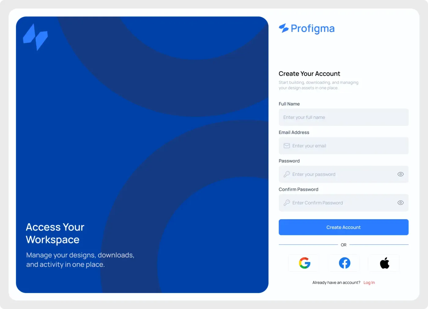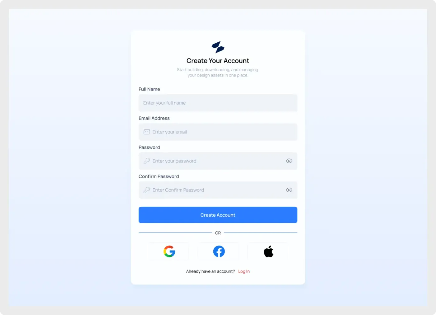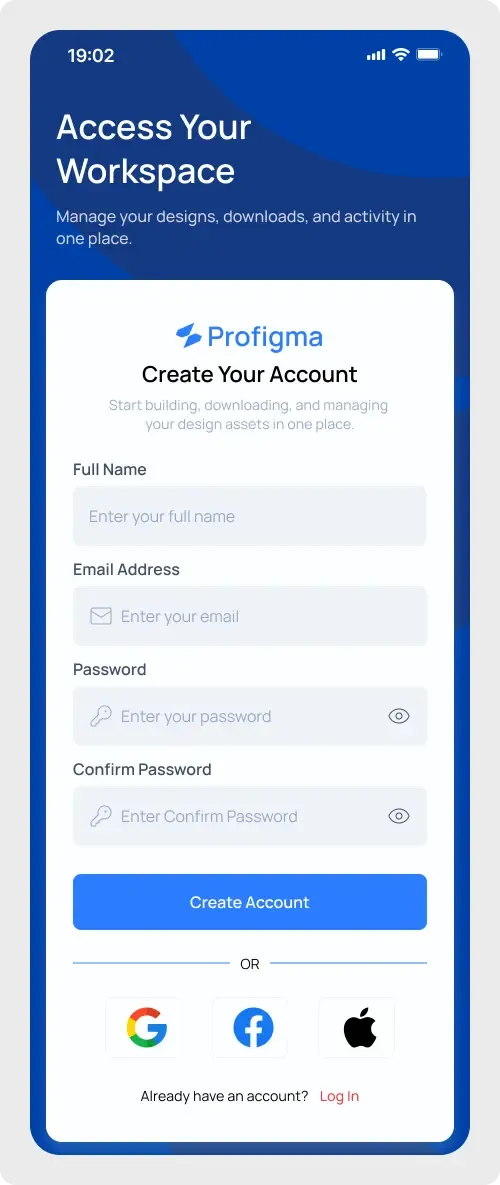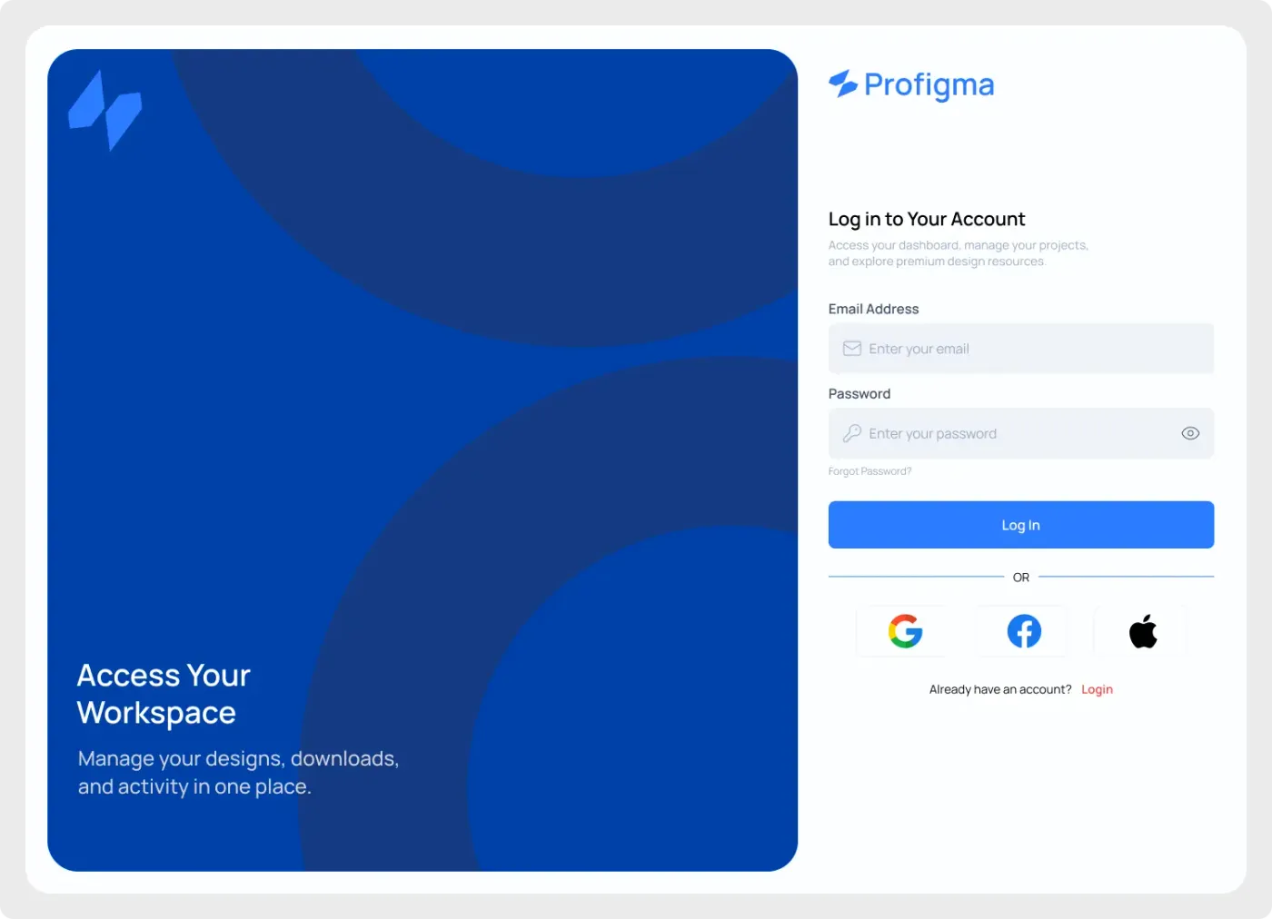
This web login screen UI uses a split layout: a bold blue brand panel on one side and a clean sign-in form on the other. It suits products that want a stronger first impression than a plain centred card.
Split layouts give a login page a clear brand moment without crowding the form. The blue side can carry a headline, an illustration or a photo, while the white side stays focused on the task. The shapes in the panel add movement without adding clutter. It is a useful pattern for products that sit behind a login and want to feel polished from the first click.
What you get
- A desktop frame divided into two halves
- A deep blue panel with large circle shapes, a logo mark and the headline "Access Your Workspace"
- A white form side with the logo, "Log in to Your Account" and a short intro
- Email and password fields, a forgot password link and a Log In button
- Google, Facebook and Apple options and a link to switch to sign up
How to use it in Figma
Click the copy button on this page and paste into Figma with Ctrl or Cmd + V. The design comes in as normal layers. Replace the headline and logo first, then recolour the blue panel to match your brand.
Best for
- SaaS products with a strong brand colour
- Dashboards and member areas
- Marketing sites that include a login step
- Portfolio pieces about authentication design
Customisation tips
- Swap the left panel for a photo or illustration and keep the text on top.
- Check the white headline against your new background colour before you hand off.
- Create the sign-up side with the web sign up screen so the pair matches. See pricing if you want unlimited copies of components like this.