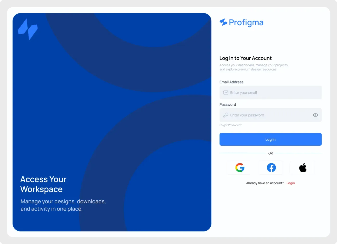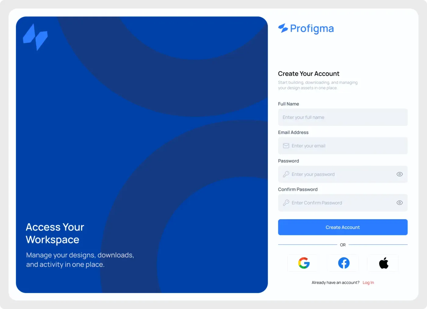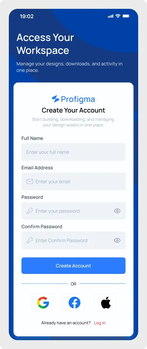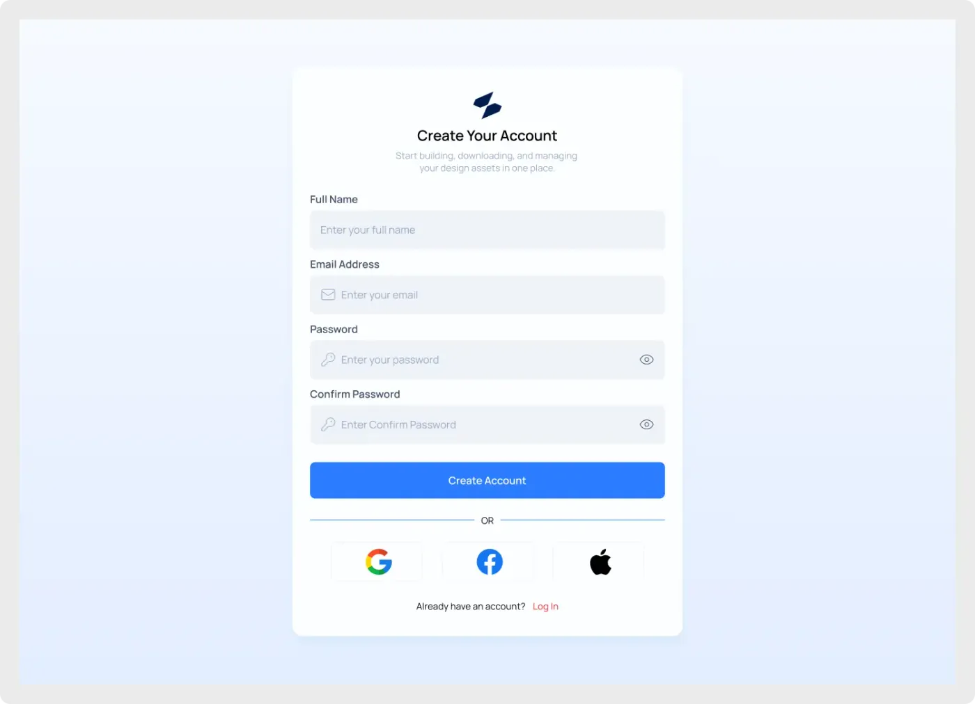
This registration form UI is a ready-made sign-up card for SaaS products and web apps. It asks for the four things most products need and keeps the layout calm, so people can finish it quickly.
Sign-up forms lose people when they feel long or confusing. This layout keeps each field on its own row with a clear label above it, so nobody has to guess what to type. The social buttons give a faster route for users who do not want to fill in a form. Use it as a base for a trial page, a waitlist or a full account creation step.
What you get
- A white card on a soft blue gradient, inside a desktop frame
- The heading "Create Your Account" with one line of supporting text
- Full Name, Email Address, Password and Confirm Password fields
- Show-password icons on both password fields
- A blue Create Account button and an "OR" divider
- Google, Facebook and Apple buttons, plus a link for returning users
How to use it in Figma
Use the copy button, then paste into Figma with Ctrl or Cmd + V. The form comes in as editable layers. Rename the labels, change the helper text and set your own brand colour on the button.
Best for
- Onboarding flows for new accounts
- Free trial and waitlist pages
- Case studies about reducing form friction
- Quick mockups for client approval
Customisation tips
- Cut the Confirm Password field if your product uses a show-password toggle instead.
- Add a short password rule under the field to prevent errors.
- Build the other half of the flow with the modern login UI component, and browse more patterns in Forms and Inputs.