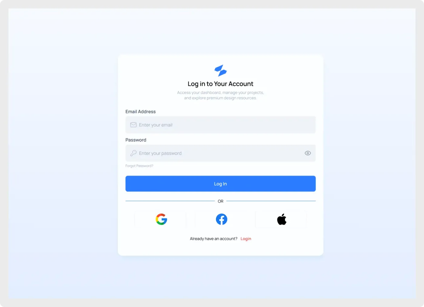
The modern login UI component is a centred sign-in card for web apps and SaaS dashboards. It sits on a pale blue gradient and keeps every element simple, so it works as a starting point or a final screen.
A good login page asks for very little and makes the next step obvious. This design does that with two fields, one strong button and quick social options. The centred card works on a wide canvas without feeling empty, and the soft gradient gives the page some depth. Because it is plain, it takes on your brand easily once you change the colour and the logo. See also the registration form UI for the sign-up step.
What you get
- A wide desktop frame with a white login card in the middle
- Logo, heading and a short line that explains what the user is signing in to
- Email and password inputs with icons and a show-password toggle
- A "Forgot Password?" link and a full-width blue Log In button
- Google, Facebook and Apple buttons under an "OR" divider
- A line for people who already have an account
How to use it in Figma
Click the copy button, then paste into your Figma file with Ctrl or Cmd + V. Everything arrives as normal layers you can rename, restyle and reuse. Change the card width first, then the colours, then the copy.
Best for
- Web app and SaaS sign-in pages
- Admin panels and client portals
- Landing page mockups that need a login step
- Design system documentation that shows form patterns
Customisation tips
- Use your own brand colour on the button and links to make it feel custom.
- Keep the card narrow. A form this short reads best at a modest width.
- Add a second version with an error message to hand over complete states. If you need the split layout, try the web login screen with a brand panel.